

A Comprehensive Guide to SEO-Friendly Web Design
In the digital landscape, businesses must prioritize SEO-friendly web design. This guide highlights core principles for creating websites that optimize user experience, meta descriptions, schema markup, URL structure, internal linking, page speed, and responsive design, ensuring sustained growth and success.
In today's digital landscape, having an online presence is no longer optional for businesses - it's an imperative. However, more than simply having a website is required. To drive traffic, leads and sales, that website needs to be discoverable and visible on search engines.
This is where search engine optimization (SEO) comes into play. SEO encompasses the strategies and techniques needed to improve a website's rankings on search engines like Google. A strong SEO strategy leads to increased organic traffic, greater brand awareness, and higher conversion rates.
For most small business owners, SEO seems complex and out of reach. However, the reality is that the foundations of SEO-friendly design are quite intuitive. By incorporating core optimization principles into the website design process, businesses can build a solid SEO base that will fuel sustainable growth for years to come.
This comprehensive guide covers the key areas that web designers need to address to create SEO-friendly websites that capture attention and climb to the top of the SERPs (search engine results pages).
Navigating the SEO-Design Interplay

SEO is often treated as an afterthought—something to be retrofitted onto an existing website. However, SEO needs to be an integral part of the website design process from day one to harness the true power of optimization.
The interplay between design and SEO may seem complicated at first glance. But in essence, it boils down to a few core principles:
Putting the user first: An SEO-friendly site provides a seamless, engaging user experience while catering to search engines' indexing needs.
Content-focused architecture: The information architecture and overall structure should revolve around organizing content to match user intent.
Code optimization: Lean, clean code enhances site speed and search engine crawlability.
Responsive design: Creating a seamless experience across devices is non-negotiable.
By keeping these principles in mind from the outset, web designers can craft websites that balance aesthetics, functionality and optimization.
Crafting Compelling Meta Descriptions: Capturing Attention and Driving Traffic
Meta descriptions, those concise summaries of a web page's content displayed in search engine results, play a crucial role in attracting organic traffic. They provide a glimpse into the page's content, enticing potential visitors to click through.
In just a few short lines, meta descriptions must communicate what users can expect to find on that page. Use these five strategies to formulate captivating meta-descriptions:
Clarity and Relevance: Accurately convey the page's essence and emphasize its key selling points. Summarize the content clearly and highlight the most relevant information.
Keyword Integration: Incorporate targeted keywords naturally, ensuring they seamlessly blend into the description's flow. Avoid awkward placements - keywords should fit into the context.
Search Intent Alignment: Tailor the description to match the user's search intent, ensuring it aligns with their expectations. Address the searcher's most pressing questions.
Engaging Language: Use captivating language that sparks interest and encourages users to explore further. Ask clever questions or highlight unique value propositions.
Call to Action: Close out with a call to action that redirects visitors to the site. For example, "See our flooring application guide" or "Browse kitchen cabinet options."
Remember, the goal is to provide users with a preview that compels them to click. Craft meta descriptions that deliver an irresistible invitation to learn more.
Embracing Schema Markup: Enhancing Search Engine Visibility
Schema markup is a semantic vocabulary that provides search engines with additional context about a website's content. Typically embedded in HTML code, this structured data enhances a website's visibility in search results and improves its click-through rate.
By helping search engines better comprehend the underlying meaning behind website content, schema markup transforms a site from a simple collection of words and images into rich, machine-readable data.
Here are some key benefits of implementing schema markup:
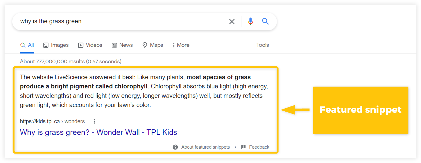
Featured Snippets: Schema can help pages earn the coveted featured snippet position, where key content is displayed prominently at the top of search results.
Enriched Search Results: Markup enables search engines to showcase additional information like images, reviews, or ratings directly in results.
Improved CTRs: The added context drives more specific targeting, increasing click-through rates.
Speaks to Voice Search: Voice assistants like Siri and Alexa rely on schema markup to improve responses.
Overall, schema markup enhances websites' visibility and discoverability. For SEO-focused sites, implementation should be optional.
Mastering URL Structure for Search Engine Crawlability
URL structure is the foundation of a website's navigation and search engine crawling. Well-structured URLs make indexing and understanding a website's content easier for search engines.
Meanwhile, more than confusing, overly complex URLs can undermine all other optimization efforts. Follow these six tips for creating clean, crawler-friendly URLs:
Meaningful Names: Use descriptive, relevant page names that accurately reflect the content - for example, "services/kitchen-remodeling."
Avoid Excessive Symbols: Keep URLs simple, minimizing using symbols and special characters. Lengthy, complex URLs are hard to decipher.
Parameter Management: Use parameters sparingly and only when essential to convey additional information. Excess parameters create unnecessary complexity.
Consistent Structure: Maintain a consistent URL structure across site sections to support intuitive navigation.
Responsive Design: Ensure URLs adapt responsively across devices without breaking.
Case Sensitivity: Use only lowercase letters in URLs to avoid duplicate content issues.
By optimizing page URLs during the website design process, businesses give their sites the best chance of ranking well in searches.
Leverage Internal Linking: Guiding Users and Search Engines
Internal linking is linking one page on a website to another. It creates a network of interconnected pages that enhances navigation, improves user experience, and strengthens a website's authority for search engines.
Here are five tips for balancing internal linking with natural site navigation:
Strategic Placement: Strategically place internal links throughout the website, ensuring they are relevant to the user's context.
Natural Links: Integrate internal links naturally within the page's content, avoiding forced or unnatural placements.
Link Vocabulary: Use anchor text and labels that accurately reflect linked content while incorporating target keywords.
Outbound Link Balance: Offset internal links with reputable external links to trusted sources where relevant. Keep users from being confined within the site.
Avoid Overlinking: Don't overdo internal linking; excessive links can appear spammy and disrupt the user experience.
Used judiciously, internal links guide users to useful information while mapping site architecture for search engine crawlers. Keep internal linking helpful, not disruptive.
Optimizing Page Speed: The Key to Smooth Browsing and Higher Rankings
Page speed is a critical SEO factor impacting user experience and search engine rankings. A slow-loading website frustrates users and signals to search engines that the website needs to be better-maintained.
Follow these seven-speed optimization techniques:
1. Image Optimization: Compress and optimize images to reduce their file size without compromising quality.
2. Minification: Minify CSS and JavaScript files to reduce their size and improve loading speed.
3. Code Optimization: Eliminate unnecessary code and optimize the website's code structure for efficiency.
4. Caching: Use caching technologies to store commonly accessed components, avoiding repeat resource loads.
5. Content Delivery Networks: Use a CDN to distribute content globally and serve it to users from nearby servers.
6. Lazy Loading: Only load visible content first, then asynchronously load the rest to accelerate the initial page load.
7. Performance Monitoring: Continuously monitor page speed using tools like Google PageSpeed Insights and address bottlenecks.
Fast page speeds lead to lower bounce rates, better conversions, and happier search engines. Make page speed optimization a standard operating procedure.
Embracing Responsive Design: Adapting to Every Screen Size
In today's multi-device world, responsive design is required to deliver a consistent, frictionless user experience. It ensures that websites dynamically adapt to optimize layout, content, images, and navigation for every screen size.
Follow these five tips for creating seamless mobile experiences:
1. Mobile-First Approach: Design websites with mobile devices as the primary focus, ensuring they are optimized for touch-based interactions.
2. Responsive Layout - Use flexible layouts, images, grids, menus, and buttons that automatically resize without horizontal scrolling or disturbances in visual flow.
3. Accessible Navigation: Keep navigation friendly for touch devices with ample touch areas, avoiding nested sub-menus.
4. Mobile-Friendly Elements: Utilize responsive images, fonts, forms, and buttons that scale appropriately for smaller screens.
5. Performance Testing: Thoroughly test site performance on both desktop and mobile to address speed bottlenecks.
With Google now indexing mobile-first, embracing responsive design is business-critical. Ensure that mobile users never feel like an afterthought - prioritize their experience.
Conclusion
Designing an SEO-friendly website is an investment that pays off exponentially in the long run. Businesses give their content the maximum possible exposure by incorporating these best practices around metadata, internal linking, site speed, and responsiveness.
While staying abreast of constant search algorithm changes may seem overwhelming, focusing on the core technical and design principles outlined here provides a stable SEO foundation. Use this guide as a roadmap, and ensure that onsite optimization informs each stage of the web design process.
With the right SEO-focused design strategies, businesses can transform their websites from static brochures into adaptable digital storefronts that engage customers while organically attracting qualified traffic 24/7. Commit to continual evolution and refinement, and your website will serve as an invaluable partner in driving sustainable growth for years.
Creating Service Pages that Rank and Convert: A Step-by-Step Guide
Get the step-by-step guide to creating service pages that rank and convert. Learn how to define a target audience, conduct keyword research, optimize service page structure, and craft SEO-friendly landing pages.
Before your website can convert visitors into customers, it needs to attract those visitors. Creating service pages that rank on Google is a critical step to getting that done.
Creating high-converting service pages is actually a lot simpler than you might think. You just need to do it step-by-step. Think of it like a construction checklist. You wouldn’t build a house by just randomly doing construction tasks out or order and whenever you felt like it.
I’m going to take you through a 4 step process to creating service pages that both rank – and convert
Step 1: Define Your Target Audience
First off, you need to know your target audience. For instance, if you’re reading this article – you probably are: A small business owner that has a website but is looking to increase your rank on Google so you can land more jobs. Am I close? Of course I am! That’s the intended audience for this article. Literally everything I’m typing is FOR YOU, Mr. Contractor.
First you need to create a buyer persona. There’s plenty of in-depth articles available all over on creating buyer personas, try this one from HubSpot – so we won’t cover it in detail here. What you need to know is that people buy for different reasons.
Say you’re a landscaper. You can have two people who both spend $20,000 on a new landscape but for two different reasons. Customer A is spending the money because he wants to one-up his neighbor who just installed the koi pond in the front yard. Whereas, Customer B just has disposable retirement income and wants to lower his tax bracket before the end of the year.
You can gather that speaking to these two groups will require a different pitch if you will.
You’ll need to first identify your target audience, and then write your service page copy for that audience.
One caveat: Let’s say you want to appeal to both the younger professional dad and the retirement grandpa - you’re better off writing content blogs for each of them and then directing them to your service page.
Step 2: Conduct Keyword Research
This cannot be stressed enough. You have to research the keywords you’re going after. Here’s the thing - not all keywords are ranked equally.
For instance – ”Landscape design” will be MUCH harder to rank for than “Landscape architect in New Bern”.
While the second keyword is easier to rank for, it probably will have far fewer monthly searches than the first. It’s a balancing act of:
Keyword volume vs. Keyword strength
Well how do you do all this research? How do you know which keywords to rank for?
Here’s a few primers on how we do this in our Search Engine Optimization for our clients:
Identify existing keyword searches that you are coming up for, but not being clicked on in Search Console.
Find other keywords that are related using a keyword tool such as AHREFS or SEMRUSH
Place all those keywords in one of their tools, and it will tell you the monthly search volume and keyword strength
Find other service pages that already rank high for the top keywords
If you’re going to target the highest strength keywords, be sure to create service pages that offer a unique perspective than the competing service pages that already rank
Remember, the higher the search volume – the more precise your service page will need to be.
Step 3: Optimize Service Page Structure
Keep all of your service pages with the same 5 part structure I’ll explain below. Bonus, if you’re using a CMS platform such as Webflow, all you need to do is create ONE service page template, and all of your services will follow the same structure! This is exactly how we build all of our custom website designs.
Here are the 5 parts to a great service page structure:
Long form, focused on the benefits (not the features)
Proof in the form of testimonials or reviews
Images and/or Illustrations
Hierarchy of typography - don’t make everything a big paragraph. Break it up.
CALL TO ACTION - this cannot be overstated. You’ll want to guide them to the next step
Discuss the importance of writing compelling service descriptions
Provide tips for writing effective service descriptions
Provide examples of effective service descriptions
Step 4: Write SEO-Friendly Landing Pages
It should be noted that the term service page, webpage, and landing page are used synonymously. For this purpose though, we’re calling them landing pages - because ideally your individual service page is where they should have landed on from Google.
To make your landing page SEO friendly, you’ll want to make sure it has the following components:
Optimized Title
Optimized meta description
Open graph image
Proper H1, H2, H3 heading structure
Use of bullet points, numbered lists, and pull quotes if you can
The title and meta description are the blue link and summary that will show up on a Google search result page.
So now what?
Well, by now you should know how to create service pages that rank and convert. If you missed some of it though, here’s the steps laid out in order:
Define your target audience
Conduct keyword research
Optimize service page structure
Write SEO friendly landing pages
It’s truly simpler than it seems. Of course, in 2023, there are tons of AI writing assistants to help you out. NOTE that I said ASSISTANT. Google has been clear about not using an AI tool to just spit out a full blog. It’s not original content, and it’s generally not very helpful - it’s too bland.
I’ve found that using AI as an assistant works best. I used two different tools to help me write this article.
Copy.AI to help create the outline.
It gave me 6 steps, I narrowed it to 4.
Then I took each step and had it write a bullet point for each step.
From there, I wrote the entire article
It’s sort of like a journal prompt but for long form content
Then I used StoryChief.io to write the article.
There was no AI used from StoryChief (though they do have that now)
StoryChief is a blog editor, it helps you keep the structure of the article SEO friendly
Plus it offers several other tools for readability, and other optimization tips.
Another option you can do is just outsource the copywriting to someone else.
Copywriters are dime a dozen though. You can literally find a copywriter for $5 on sites like fiverr.com - but you WILL get what you pay for.
In other cases, I’ve seen articles written for as much as $300-400 per article.
We’ve worked with many different copywriters over the years, and have a good list we use. If you need help managing your SEO, give us a shout.

5 Marketing Strategies for Local Service Providers
Every local business owner has the same concern; how do I get customers? It is a common problem because with no customers you have no income. Below I want to highlight 5 marketing strategies that local service providers should consider implementing.
Every local business owner has the same concern – how do I get customers?
It is a common problem because with no customers you have no income.
Revenue = barbeque on the patio. Less revenue = less barbeque. You know where this is going...
Below I want to highlight 5 marketing strategies that local service providers should consider implementing.
1. Provide a service people need.
The first step to success is making sure your product or service is a necessity. When someone needs something, they will be more likely to pay for it.
If you provide a service that people can't live without and have no other way of obtaining, then you'll have a better chance at building a successful business.
In addition to providing a useful service, it's also important that the service be valuable in some way. People need many different things throughout their lives: from laundry services and pest control solutions to plumbing repairs or real estate consultation services.
There are plenty of opportunities out there if you're willing to put in some hard work and creativity!
2. Establish a target market
Before you can start marketing, you need to know who your target market is. This will help shape the types of marketing strategies you use as well as how much effort and money is spent on each strategy.
Start by determining who your customers are. Are they single mothers in their 20s? People between the ages of 35-45? Business owners? Seniors? Once you know this, consider what services they need and how often they need those services (for example: once a month or every six months). That’s when it gets tricky: You have to figure out who your competitors are!
Competitors include other local businesses providing similar products and services, but also people within the same community offering complementary products/services or even other industries that might cross over into yours (such as restaurants serving food). Don’t forget about online options too—your competition could come from anywhere!
3. Create a professional website and online identity.
It's not enough to be on the web. Your website design needs to be professional, and it should reflect your brand.
In a few steps, you can turn your website into an online identity that will help customers find you easily and build trust in your company:
Use a professional email address – like name@companywebsite.com.
Use a professional phone number.
This could be your business line or a dedicated cell phone number for marketing purposes only. Make sure this is listed on the site so that customers can call if they have questions or concerns about service before they schedule an appointment.
Make sure there is consistent messaging across all of your channels.
It should be clear what they can expect when they interact with you online or in person through communications like social media posts, blog articles or newsletters.
4. Build a reputation.
The next step to building a thriving business is to establish your reputation. Your customers need to know they can trust you, and that's why it's important to give them reasons why they should both love you and keep coming back. There are many ways you can do this:
Quality: Make sure your work is always done right the first time around.
If there are any problems with a job, fix them immediately so that no customer will have cause for complaint.
Reliability: If someone needs something taken care of by a certain date or time, make sure it gets done on schedule
And if there are any delays along the way (e.g., weather or other factors), let your client know immediately rather than leaving him hanging in suspense while waiting around for his lawn service guy who might never show up at all!
This helps build credibility by proving how reliable and trustworthy you truly are as an individual or business owner/operator—which in turn will attract more potential clients over time (and probably make current ones happier too!).
5. Get involved in the community and local organizations.
In order to be successful in any local business, you have to be a part of the community. Just like a person cannot run for public office without first establishing their credibility within their district and earning the trust of voters, a service provider must also establish themselves as being committed to helping out in some way before they can expect people to consider buying from or referring them.
The best way for local service providers to do this is by getting involved in events that have nothing whatsoever with marketing or sales.
A great place for this would be volunteering at local schools; many teachers are short-staffed and could use help on field trips or at school functions outside of class time.
Another option would be joining one of your city's business associations, such as a chamber of commerce.
This gives you the opportunity meet other professionals who work in similar industries and learn about upcoming opportunities such as grant programs or tax breaks that may benefit your business (but which won't usually come up during general conversations).
These marketing strategies can help bring new customers to your local business
When you're starting out, it can be hard to find new customers. The good news is that there are a few things you can do to help bring them in.
Identify your target market. You need to understand who will be interested in what you provide, and why they'd want it. If you're selling hot dogs on a street corner for $0.50 each, then everyone should have hot dogs! But if you're selling luxury cars for thousands of dollars each, then maybe only wealthy people will buy from you.
Provide a service that people need (or think they need). If no one needs your product or service enough for them to pay for it, then no matter how many ads or marketing campaigns or promotional events (like parties) you throw at them—they won't care about coming over!
Create a website that is professional and has a clear message
Build your reputation, be known for quality work and being reliable
Get involved in your community
Conclusion
When it comes to marketing your local service business, the key is to be flexible and creative. You’ll need a solid marketing strategy in place before you can implement any specific tactics.
If you want to find new customers, then it's important that your company finds ways to connect with them by partnering with the right marketing agency.

What is the best email marketing service in 2022?
If you've spent any time on the internet, I'm sure you've seen ads for email marketing software. There are tons of companies that offer this service, but which one is right for your business? Well, first of all, let's look at some of the biggest players in the game:
There are many different email marketing services, but they all have pros and cons.
👍 Pros and 👎 Cons Overview
MailChimp is great for beginners and small businesses—they have a free plan that allows you to send up to 12,000 emails per month. Their interface is easy to use and they have an intuitive drag-and-drop builder.
Mailerlite is good for small businesses that want more customization options than what's available with Mailchimp. They also offer an unlimited free plan (you just can't send more than 10k emails per month).
Constant Contact is best suited for large companies who are looking for robust reporting tools and automated marketing campaigns. Their pricing starts at $99/month, which includes unlimited emails sent each month up to 5,000 contacts total (including subscribers).
ActiveCampaign offers flexible plans starting at $9/month, which include features like A/B testing, drip campaigns and integrations with Zapier or Google Analytics 360 Suite APIs
MailChimp
Mailchimp Email Marketing Platform
MailChimp is one of the most popular email marketing services, and it's no wonder why. They have a free plan that can be used by anyone without limitation, including sending up to 12,000 emails per month. The interface is easy to use and MailChimp offers a range of features that are useful for beginners and advanced users alike.
The main benefit of MailChimp is its simplicity: you can send emails easily through an intuitive interface or manage your accounts with drag-and-drop functionality. It’s great for beginners because there are no complicated settings or configurations required—just set up your email list in minutes!
(courtesy mailchimp)
MailChimp also makes it easy to create segments out of your subscribers based on their behaviors (what they clicked on) or demographics (where they live). This enables you to better tailor content based on what you know about each customer so that each piece reaches them at just the right moment—whether that’s when they just signed up for your newsletter or when they made their first purchase from one of your products.
Mailerlite

Mailerlite, an email marketing service that boasts over 1 million users, is a good choice for small businesses. Their service is super easy to use and has both free and paid plans. They also have a great customer support team and reporting system so you can keep track of your campaigns' success rate.
The pricing structure at Mailerlite is pretty straightforward— It's free for the first 1,000 subscribers, then it's $15/mo if you're going solo (with up to 2,500 subscribers).
Constant Contact
If you don’t know about Constant Contact, well, that makes sense because this is a service for small businesses (emphasis on small) and it's not one that gets much press outside of those circles.
For these reasons alone this might be why many people are surprised to learn that Constant Contact has more than 2 million users and over 25 years in the business. It also has a great reputation among its users and is considered one of the best email marketing services out there by many marketers. That's right: it has both accolades from critics as well as positive feedback from actual customers! In fact, according to our research only MailChimp has more 5-star reviews on Trustpilot than Constant Contact does at the time of writing this article (the numbers keep changing but we'll update them if they change).
Constant Contact Marketing Automation
While it may not have quite as many features or capabilities as other options out there like MailChimp or Mailerlite, what makes Constant Contact stand out is its lower price point ($9/month) when compared with other similar services like Aweber ($19/month), Infusionsoft ($29-$99/month depending on plan type), Ontraport ($99-$299/month depending on plan type), Hubspot CRM ($150-$300/month depending on plan type), etcetera...
Active Campaign
Active Campaign is a popular email marketing service that's cheap, easy to use and has great customer support. Active Campaign does have a lower limit on the number of emails you can send per month, but if you're just getting started with email marketing or aren't sending very many emails yet it should be fine.
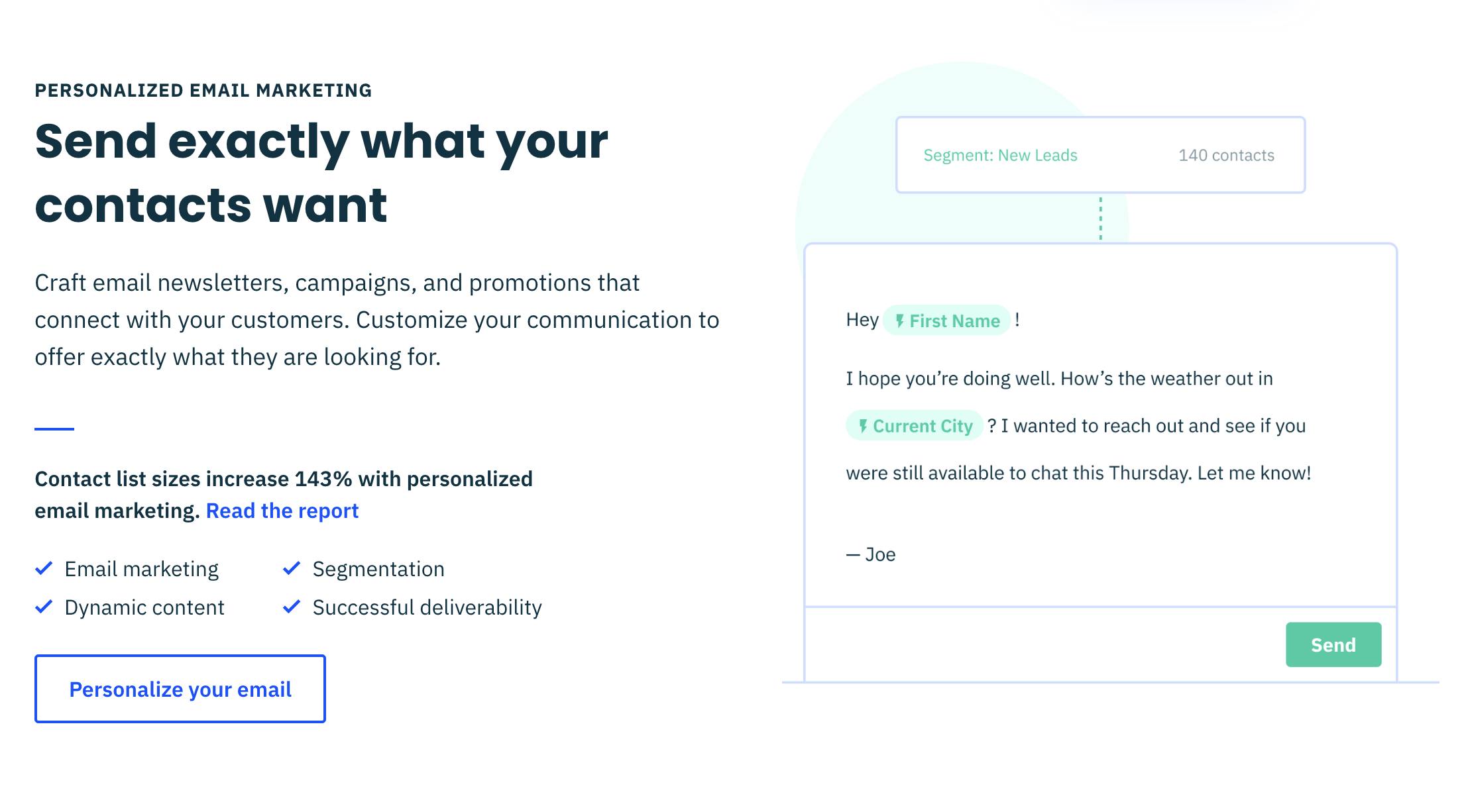
Active Campaign Personalized Marketing
The free plan also has some nice features like form customization, autoresponders, landing pages and SEO tools. You can even import your existing contacts from MailChimp or Constant Contact into Active Campaign using this CSV import tool from their support center!
Email marketing software can help you grow your business.
Email marketing makes it easy for you to build relationships with customers. The best email marketing tools make it easier for you to create, send and track emails. You can use them to automate your email campaigns, so that you don't have to do all this by hand. Email marketing software helps you track the results of your campaign so that you know what worked (and what didn't).
Conclusion
Email marketing is a great way to reach your customers and grow your business. It’s also easy to get started with email marketing. There are many different email marketing services, but they all have pros and cons. If you want something simple that doesn’t require much learning, go with MailChimp or Mailerlite. If you need more advanced features like A/B testing, segmentation, etc., then choose one of the other options on this list!

Five Features Your Website Homepage Should Have
A website homepage serves as the first impression and is the ultimate key to the site's success and visitor retention. Hence, it should contain all the essential elements. Your favorite site follows similar rules.
You may have noticed how many of the elements on your favorite websites' homepages look quite similar. Well, that is the drill! They are, by no means a mere coincidence but a deliberate choice. This is because a website homepage serves as the first impression and is the ultimate key to the site's success and visitor retention. Hence, it should contain all the essential elements. Your favorite site follows similar rules.
It is very important that your homepage, within a couple of seconds, delivers concise information about your product or service. Using this technique, you grab visitors’ attention.
If you are wondering what top features make a homepage effective, keep reading to find out.
Straightforward navigation
Besides the logo, the next element on your priority list should be to-the-point navigation. To put it simply, the site should always have a search tab if the website is highly content-driven. Considering that navigation serves as a guideline or road map, it should be easy and not a hassle to locate. In addition to this, try and have descriptive navigation as it proves to be beneficial when it comes to reducing bounce rates.
Headline
Ever since technology has taken over, attention spans have greatly reduced. Therefore, while designing your site's homepage, make sure it is able to leave an impact and tell what you offer within a couple of seconds.
This is where a headline comes handy! A headline, coupled with a sub-headline, should be able to describe your business and its offerings clearly. You should be able to wrap up everything in 2-3 powerful sentences.
Visuals
Nowadays, people care about visuals and aesthetics.
A photo that demonstrates how users can benefit from your product is always better than a stationary photo. Our brains are wired in a way that we automatically feel a connection when we see a human face. Moreover, visuals, as in photos, add credibility to a site and give it a unique appeal.
Call to Action or CTA
An effective homepage is one that instantly piques customers’ interests and compels them to dig deeper into the site. To make this possible, it is important to include a hooking call to action (CTA) as it can really draw visitors to the interior pages and initiate some sort of contact. Make sure these CTAs are easy to click so that visitors feel like investing their time and exploring your site.
Logo
Your main goal is to make sure your visitors leave with a sense of familiarity; you’re your product or service. Hence, it is important to give your logo placement a major thought. A logo is a direct representation of your brand, product, or service and core values. This is why you should always place it at the top where it is visible. This will allow you to form a bond with customers. Moreover, the logo on a website is often a direct link to the homepage. So, naturally, you should place it in the header for ease and convenience.
By the way, it is no mistake the logo was placed last in this list. As in, this is the least important part of your homepage. It should most certainly include a logo, but the focus should be on user experience (navigation) and conversion (headline, visuals and CTA).
What's On Your Homepage?
Would you like a free audit of your homepage? Get in touch below.

How to Hire a Web Designer
If you are looking to hire a professional to build a website for you or for your company, you should really be aware of the major benefits it can bring to your business and what services you may need to ensure you have a bigger chance of success.
Many of us use the two terms web design and web development alternately, but these definitions really have two quite different meanings. If you are looking to hire a professional to build a website for you or for your company, you should really be aware of the major benefits it can bring to your business and what services you may need to ensure you have a bigger chance of success.
The construction of your website site is one of the most important steps in a successful marketing campaign for any organization. Your website allows your potential customers to have the first impression of the products or services offered by your company. A well-designed website can do real sales miracles, as it is the most popular means by which a business can be promoted around the world. A website should be designed to present products or services with easy, user-friendly browsing. Optionally being able to set up ecommerce which is becoming even more important in today’s society.
How can we help?
At Bear City Impact, we design and develop each website with an organized plan which is modified accordingly to suit the requirements and needs of your business. In addition to creating this bespoke website for your brand, we offer almost unlimited support for the life of their website at no extra cost. This means you can rest assured that any technical issues will be dealt with promptly and professionally - without any surprise invoices. Our team also follows all the developments on the internet as well as the trends that prevail in SEO. Thus, the configuration and construction of the website will be done in such a way as to achieve the best ranking in the search engines (Google, Yahoo, Bing etc.). This is an excellent way to promote your business.
What specifics do you offer?
Our goal is to help businesses thrive and in our ever changing world, technology has to match what is going on around us. Many businesses want to make the switch to ecommerce and we provide semi-custom websites using the Webflow platform or Shopify for ecommerce, which makes it a simple and easy to navigate website that is pleasing to the eye and holds all the relevant information for your prospective customers. Essentially, our goal is to design a website for your business that turns visitors into customers.
We love easy to navigate and simple layouts. The easier the structure of the site, the easier it is for users to navigate. Each section must tell a story. it needs a reason to exist and an end result for the user. The layout should help the content to highlight the most important parts of this story. In fact there should not be too many invitations to action on one page - everything should lead to this final "What can I do here?" This is how we can ensure that you are meeting your desired criteria for your website.
We ensure that we communicate well with you every step of the way to ensure that we are hitting your goals and creating something that works for you. With mobile sites taking precedence, it is no wonder that mobile web design has become a trend. Mobile web design has fundamentally changed the way websites are designed. Once upon a time, the only sure thing was that a website would only be designed for desktops or laptops, and a mobile-friendly design could possibly be added. Now the exact opposite is happening, we start first by designing a mobile friendly site and later a version that will work for a desktop user.
Again, this drive to design primarily for mobile is not based solely on ranking factors or SEO. The visual effect is something that will first of all enhance the user experience on your site and will satisfy the desires of mobile phone users, which will be a priority for a long time to come. With the help of our team, you can ensure that people can browse your sites, shop online with an easy method that works for everyone.
Our mission
Speed and minimalism are the trends that appear again and again when we talk about web design in 2020, which is an important reason why we like to ensure that everything is just right for you. We want your business to thrive and it all begins with a tailor made website that provides you with all the pages you need to create a professional looking website. This will not only instill trust into potential buyers but generate further interest and improve SEO.

5 Ways to Make Your Website Mobile-Friendly
Back on 4/21/2015, Google Released what is now known as the Mobilegeddon search engine update. Today, website still are not optimized for mobile viewing experience.
Hey, is your website mobile-friendly? Just because you can pull it up on your phone doesn't mean that it's mobile-friendly.
Exactly five years ago today, April 21st, 2015, Google released one of the biggest search engine algorithm updates that ever impacted websites. It was commonly referred to as mobilegedden.
Basically what happened was Google no longer gave search priority to websites that did not have a mobile-friendly or mobile optimized website. If your website was not mobile-friendly, they’re no longer going to show your website in search results when people are searching from a mobile phone.
Now, that was five years ago in Google wanting to put an end to these non mobile-friendly websites, but they still exist today. We still have websites that are not mobile-friendly. Why isn't this even as such a big deal?
You know, mobile browsing is not for just teenagers that are on their phones, it's everyone. Everyone is primarily using their mobile phone to browse the web and interact online.
Now to clarify one thing here, web designers in the past from April of 2015 and on have been making websites that were for desktop – mobile-friendly. But all they were really doing was making it mobile compliant.
They weren't really designing with the mobile user experience in mind.
So this is what I'm really going to be talking about today is ways to look at your website and kind of do a mini audit of your website to see if it passes these mobile-friendly barriers, these mobile-friendly checks.
So I've got five ways that will just tell you whether or not your website is actually mobile-friendly or not.
You just follow along with me through my client's website for a restaurant here. So that way I can show you what components go into making a mobile-friendly website.
Optimize The Mobile Header
The first thing you'll notice is this, a kind of what we call the header. The header is basically the very top part of a website. It often stays there throughout your scrolling experience.
Sometimes it doesn't, but that's actually a sub little thing is, is making, especially on mobile, making sure that the mobile headers, what we call sticky, which basically means it sticks to the top of the page.
That way the menu easily accessible at any time. If you have perhaps a longer homepage or a longer menu page you don't want to have to have that person scroll all the way all the way back up to the top just to get to the menu basically.
But the other part of this header is that you want to make it smaller. I often see websites where the header kind of takes up like half the phone. Every time you go to a new page, you have to immediately scroll because that header is taking up most of the space on the phone. I think that's a big no-no.
It's subliminal, but I think it's enough to make people frustrated. It makes me frustrated anyways, and that's how I usually look at things. If it gets me frustrated, it probably gets someone else frustrated.
Easy Menu Navigation
The second thing is an easy navigation. So if you'll notice here, if I hit and tap on the menu here, this is super easy to navigate around. I don't have to go looking through a whole bunch of things, um, to kind of get what I want to.
Again, this is a restaurant site. I mainly deal with small business website design.
Another thing to consider is, if you'll notice in the top right here, there's a little phone icon that makes it easy for me to call the restaurant. If I tap that call button, it's basically gonna prompt me to open that phone up or phone number up in my dialpad without first having to copy the number down. Or remember the number
Legible Text on Mobile
The third thing to consider is easy text or that the text is legible. So one thing we don't want to do is place it on backgrounds that are very hard to read. So if you'll notice here where it says best sports bar, it's in larger bold types.
Even though there's an image there, it's easier to read. And there's also a bit of what we call an overlay on top of that image. So it kind of darkens the image up basically, so that it is a little bit easier to read that text.
No PDF’s For Your Menu
The fourth thing that is super irritating, this probably drives me more nuts than anything else, is not using PDFs or images to display content.
I'll give you an example here for a restaurant. If I go to their menu, you'll notice here this is super easy to read. I can close or collapse different sections of their menu. This is what I call an interactive menu.
But this could be a services list if you're a service based contractor, or if you're just like a brick and mortar place and you just have like a bunch of images of like your promotional signs and stuff like that.
To me, this is a huge no-no, because when you're viewing on a mobile phone, you often can't read that and you're thinking that everyone's viewing this from a desktop and they're not.
Now what happens is I have to now kind of pinch and zoom my way around that photo, especially if it's a menu. It is by far the most frustrating thing viewing a website is when you use PDFs or images to display your content.
Re-type it, do something, just get it into an interactive form like this menu here.
Use Call To Actions (CTA) That are Mobile Specific
And the last thing is using call-to-action buttons that are specific to the mobile experience. I touched on a little bit ago with the call with the phone call button that was at the top there.
You'll also notice here on the homepage, I have a couple of buttons. One of them is tap-for-GPS and the other is tap-to-call-us. Those buttons do not appear on a desktop.
Viewing this from a desktop, you will not see those buttons there. This only appears when they're viewing it from a mobile device because that's where you're going to be calling from.
Just consider the type of call to action that you want a customer to make device specific.
All in all, what I would just say, go through those five things I just mentioned to check your website out.
Ask: Is your website easy to get around from mobile device. And don't look at it yourself, perhaps have someone else look at it because you're too close to it, you know exactly where all this stuff is.
Give your website to someone that's never viewed it before, like a friend or a family member and just kind of say, Hey, is this easy to browse? Is this easy to get what you would be looking for if you are shopping for my service or product.
If it is then great and leave it alone. Don't fix what's already working.
But if it's broken a little bit, then considering evaluating the content that's on your website and the design and layout.
I offer content strategy services where we can go through your entire website line by line and really discover the broken pain points of it and the things that are working.

Why Using a PDF Menu On Your Website is DEADLY
Why is your website using a PDF version of your menu? Heads up: It's difficult for visitors to read by pinch and zooming the menu from a smartphone device, and Google does not read text from an image so you lose all of that SEO juice.
Why is your website using a PDF version of your menu?
Heads up: It's difficult for visitors to read by pinch and zooming the menu from a smartphone device, and Google does not read text from an image so you lose all of that SEO juice.
Try this instead: Create an HTML (text) version of your menu.You can still make it look beautiful and fancy just by designing it properly, but designing it for a rich web experience.
A PDF that your menu designer makes is intended on printing, not viewing on the web.
This is a new series I'm trying out. Quick(er) videos, one take, on short subjects.
I get asked these kinds of questions all the time and I catalog them into my notes app. I never discuss them because they don't really fit into a "tutorial" style video.
I think a video to just briefly discuss and answer the question is useful though.
What do you think? Drop a note in the comments if you like this style.

How To Create Web Forms Easily and Quickly
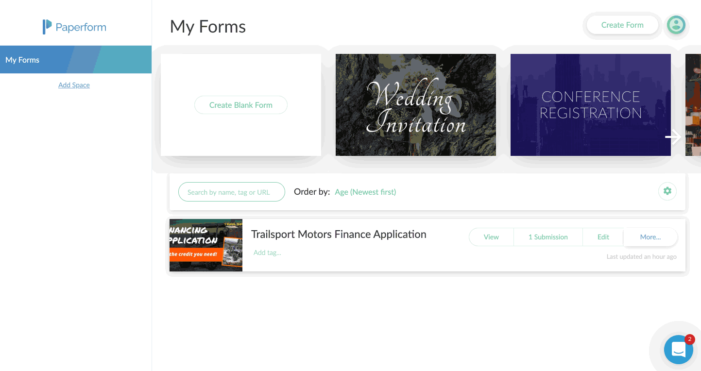
I recently had a chance to dive into Paperform, an online form creator that allows you to create beautiful forms, that according to them, is as easy as writing a word doc. They’re right. I made an entire finance application for a client in less than 15 minutes.
Name, Email, Phone, Message.
How many times have you seen this on a website?
That’s probably the most vanilla way to get information from your visitors.
The world wide web needs more birthday cake ice cream and sprinkles.
I recently had a chance to dive into Paperform, an online form creator that allows you to create beautiful forms, that according to them, is as easy as writing a word doc.
They’re right. I made an entire finance application for a client in less than 15 minutes.
Including customizing the style to match their branding, and placing it on their Shopify website.
In this article, I’m going to show you:
Why you should use an online form builder
How to use Paperform as a marketing and sales tool
A step-by-step guide to creating a form
Why use an online form builder
It’s quite possible that your website platform already includes a form builder. Popular sites such as Squarespace, Wix, Weebly all have their own. Rocket Websites by Bear City Impact also include a form builder, that’s native to our platform.
However, almost all form builders are very basic, eh hem, vanilla. Usually, there’s no customization, and it’s limited to just simply adding a form field and letting the visitor enter information.
An online form builder, such as Paperform will not only let you customize the look-and-feel of your form but also include powerful tools to use it as a marketing and sales tool.
Basically, it lets you turn your vanilla form into a pint of Chunky Monkey Ben & Jerry’s.
Here’s what Paperform will let you do instead.
How to use Paperform as a Marketing and Sales Tool
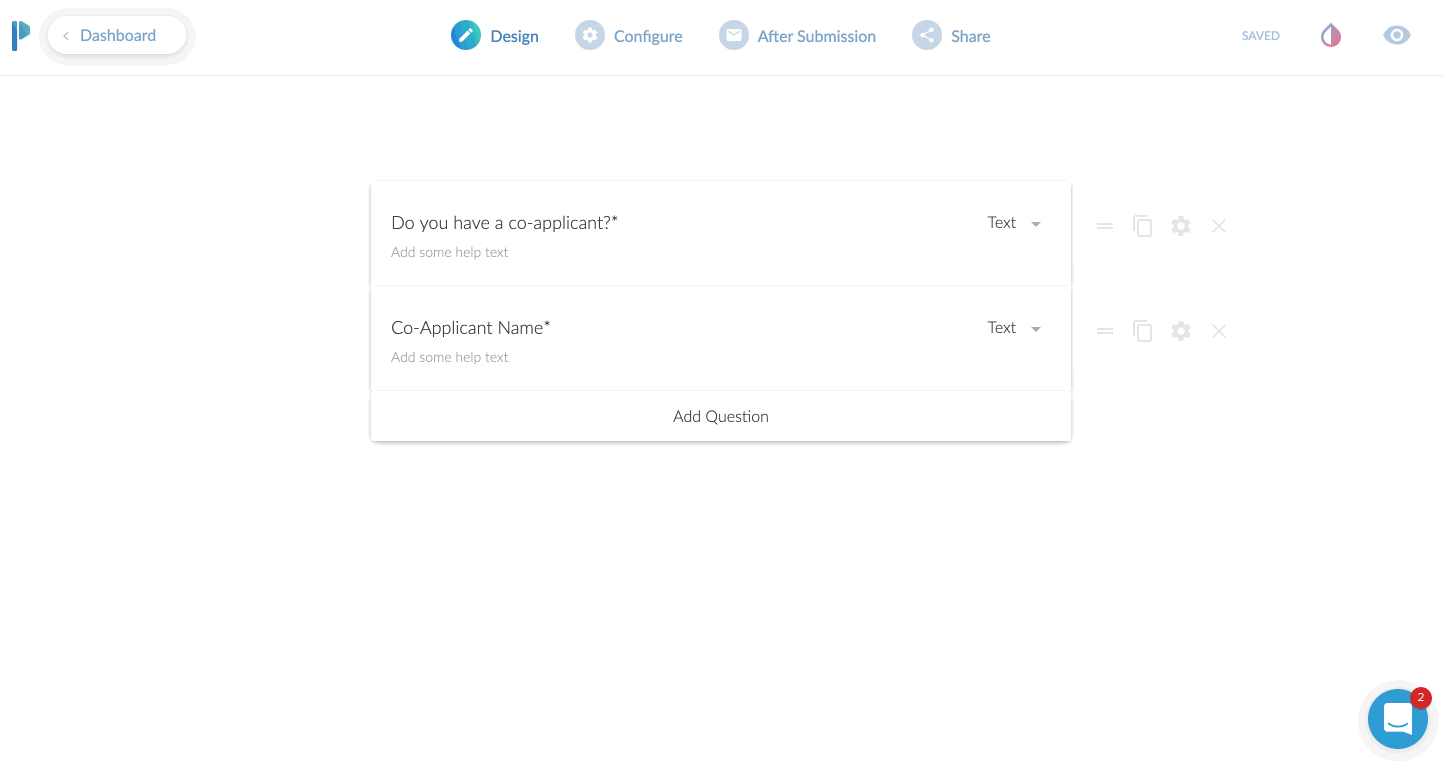
Use conditional logic
This is an extremely powerful feature. In short, what this does, is only show a field based on the input of another field.
Case use: Ask a Yes or No question such as “Do you have a co-applicant”, and if the user responds YES, then and only then, do you ask for the co-applicants information.
Why even do this? Well, long forms can be super intimidating. So the less information you can show to someone, the more likely they are going to fill the entire form.
Even if your form is relatively short, it still makes the form less intimidating. Create as little friction as possible.
Take Payments
YES! You heard that right. You can use Paperform as an online order form, or to take donations or create subscriptions right from within the form. They have claimed to take over $10,000,000 so far in credit card payments.
You can have a form that sells just one product or a menu list of products to order.
Or, set the form up to create a subscription service.
Taking donations, but want to let your donors pick their own amount? Perfect. Just leave the field blank and let the donor enter their own dollar amount to charge.
They integrate with all the popular services, Stripe, Braintree, PayPal, and Square.
Custom Email Notifications
I think this is a fantastic benefit to using Paperform.
99% of the forms I’ve ever used only allow me to adjust the email address the form details should be sent to. You get what you get.
With Paperform, you can set a primary recipient, plus an additional CC AND a BCC recipient.
This is very useful for sending to multiple team members.
If you had a lot of fields on the form, you can have a PDF version attached in the email.
Here’s a super nerdy hack-use-case for this:
Most printers today have the ability to print from the cloud or email. For instance, if I send an email to my printer’s email address, it will print that email or document!
Set your form to email yourself, and then CC your printer’s email so it can automatically print out all new leads for you and give you a personal notification!
You can also specify the “reply-to” address. Why do this? Well, you can actually use an email from the form itself to reply to.
Case use: Using as a lead gen form, after getting the form submission sent to you, when you hit REPLY on your email, it is replying to the new lead directly!
App Integrations
Everything is more fun when you play nice with others.
Sure, it’s cool that you can send the details of the form to your email.
Buttt, what if you could send all of the data, or even just some of it, to an app that you already are using.
Case uses:
You’re collecting survey data, and you want to send it all to a Google Sheet
Create a newsletter signup form, and send the data to your favorite email app such as Mailchimp or Hubspot
Use Zapier to send the data to 1,500+ apps
Share as URL or Embed
Once you create the form, you’ll need a way to get it in front of people.
The most common method will be to embed this into your website. In other words, you want the contents of the form to seamlessly live on your website’s contact page or somewhere else.
Here’s another method. Just share the direct URL. Every form you create on Paperform will have its own unique URL. You can customize the URL to your liking as well.
It will look something like this: https://your-form-name.paperform.co
This is awesome because you basically don’t even need your own website to capture new leads or sell products. All you’ll need is the URL of your form, and then share it on social media, send it in email newsletters, text it to your grandma, whoever!
Templates
Personally, I’m not usually a template fan. I feel like templates are just soooo generic. Aka, vanilla. (Notice a trend here?)
Here’s why I really like Paperform templates though:
There’s a wide variety to choose from
You can interact with the template before using it
They feature rich content including images and video
They’re free and included on all plans
Using the templates by Papeform will be very helpful if you’re planning to use this as a direct sharing URL, or basically as a mini-webpage.
By using one of the templates, you can create a highly engaging visual experience that feels like a webpage, because well, it is a webpage.
Analytics & Tracking
Going along with the theme here of using Paperform as a mini-webpage, you can actually track the entire form still!
First, you’ll add your Google Analytics ID and Facebook Pixel.
Then, you can add scripts (or tag events) after the form is “submitted”.
Case use: You can send the Facebook or Google event “Lead” after a user completes the form, so you can track the return on investment of an ad.
This is also beneficial to use, even if you are going to embed (integrate) this on your website. Your website might not have the ability to add a tracking pixel to it, or you might not have control of this. By adding the tracking code to Paperform, you can ensure you are tracking the results.
Ok, now here’s the meat and potatoes of how to create a web form using Paperform.
A Step-by-step Guide to Creating a Form
First, you’ll create an account, utilizing their free 14-day trial. You won’t even need to put your credit card in to try it out.
After that, you’re in the dashboard and ready to create your first form.
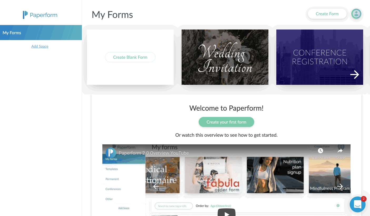
You’ll just click on the Create Form button in the upper right corner.
Give your form a name, and then choose to either start from scratch or use the built-in templates.
In my case, I chose to start with a blank form. I sort of wanted to see how long and potentially difficult it would be to do this without the option of a template.
I was pleasantly surprised at how easy it was, albeit a few learning curves.
Probably the biggest learning curve for me was that you just sort of start typing. Or you can hover over the tiny icons to the left to indicate what you are adding.
For example, the icons on the left allow you to add a form field (question), an image, a video, or a break point, which splits the form into multiple “pages”.
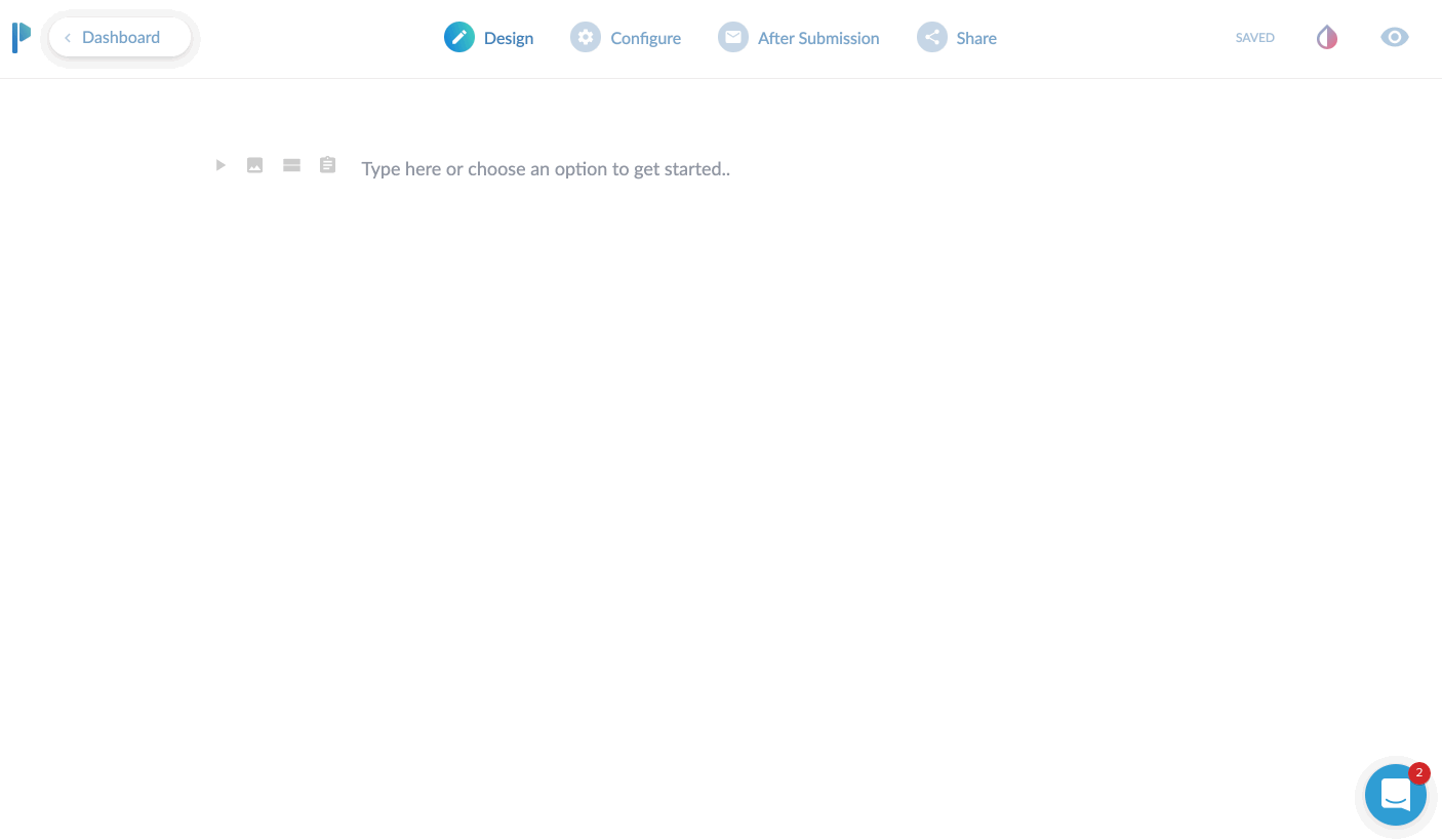
If you only start typing, you’re basically just putting in text. This is useful to preface what the form is about. I would say this is even more useful if you plan to use the form as a landing page, since you can pretty much put all your sales copy at the top and then build out the form.
If you’re planning on embedding (integrating) this onto your website, you might be able to just skip adding headings and paragraphs here and jump right to adding form fields.
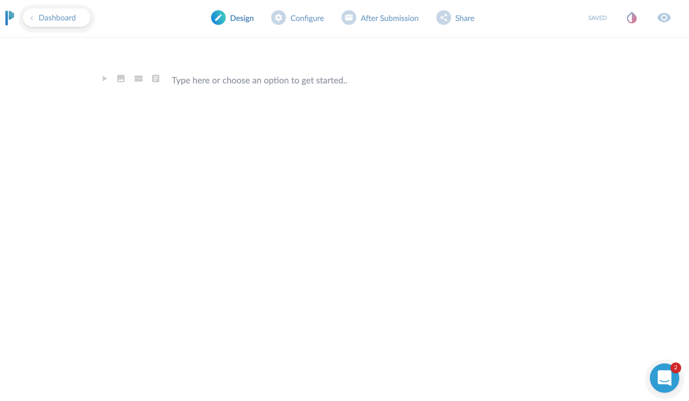
I’ll give a brief overview of the top toolbar area. Currently, you start in “DESIGN” mode. This is where you’ll lay out your form with all of the input fields, headings, images you want to use etc.
There are three additional main tabs at the top after that. CONFIGURE, AFTER SUBMISSION, and SHARE. We’ll dive into each of these.
The Design Tab
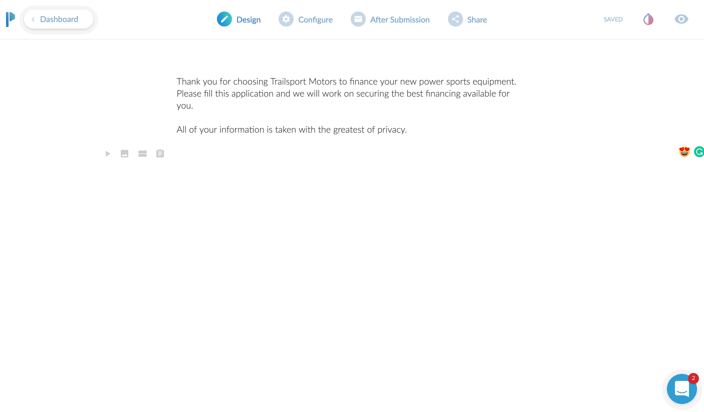
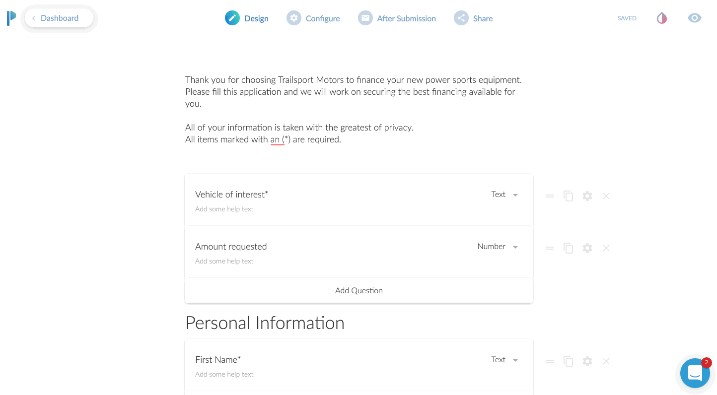
We’ve already added an introductory paragraph here. In this above screen play, you can see me clicking on the “questions” icon so I can add my first input field.
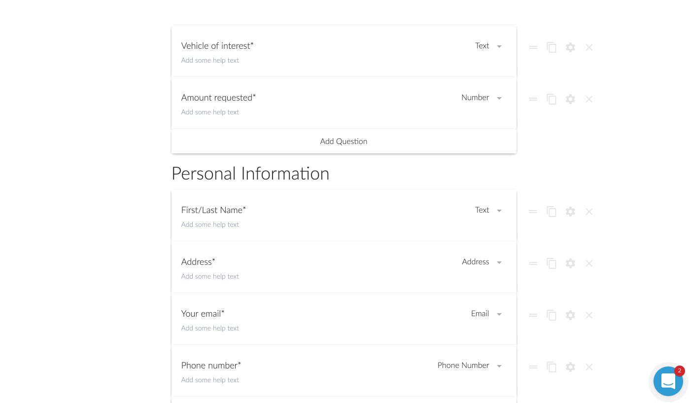
In this case, we’re asking for their “Vehicle of Interest”. To add a second field, I just click the “Add Question” at the bottom here. Super easy!
You’ll notice you can change the field type from “text” to a variety of options. You can choose from other common fields such as address or phone. There are some advanced fields you can do like multiple choice, dropdown selection, or a very handy signature input!

The signature input is very handy if you need to have people sign contracts here, or just need a signature for proof of submission as well. From a desktop computer, it was easy to sign by moving my mouse. On a tablet or phone, they can just do it with their finger. Or a stylus if you’re one of those people that carry a stylus around to use on your phone.
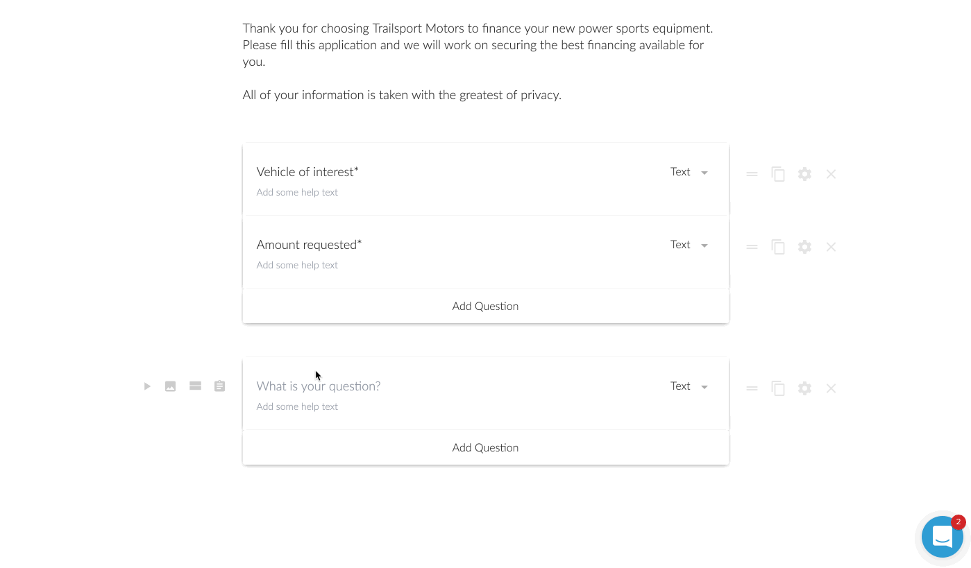
Now in this next step, I wanted to add a heading in between the different groups. This might be a little specific case use, but I was creating a longer loan application. I wanted to break up the sections. Another option I could have done was to add a ‘break’. This would make it so after those first two questions were answered, there would be a “next >” type of button.
For the loan application, I opted for to break it up by using headings. However, is this was a lead generation form, I am a huge fan of multi-step forms. It was one of my conversion trends for 2019 that I laid out on YouTube. Multi-step forms are perfect for lead generation because they assist with micro-conversions.
A micro-conversion is someone just only typing in their zip code for instance and clicking next. Once they type in their zip code, they’ve already micro-converted ONCE. Now you just need them to do a few more micro-conversions until they reach the end.
It’s far less intimidating to enter a zip code real quick than to be presented with 7 questions for a lead.
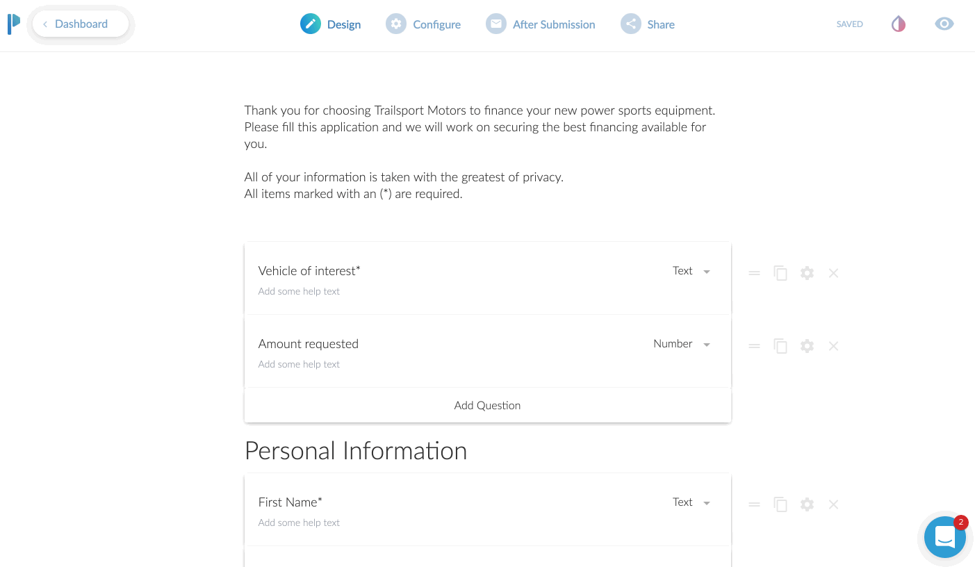
Question is Optional
For some of the questions, I wanted to make them optional to answer.
This was probably the first thing I had to think about for a moment on how to do. I then realized there was a little gear icon next to each field. Clicking that brings up a host of options to consider. One of those being “question is required”.
By default all of the questions are required, but unchecking that box makes the question optional.
Previewing Your Form
At this point, I was feeling pretty good about how my form was shaping up, but I wanted to see it in action.
This was no sweat at all. You just click on the little “eye” icon to preview it for real. You can even enter in the fields and click the different buttons on the page. It was here that I realized I wanted to change the stock blue buttons to match the branding of my client.
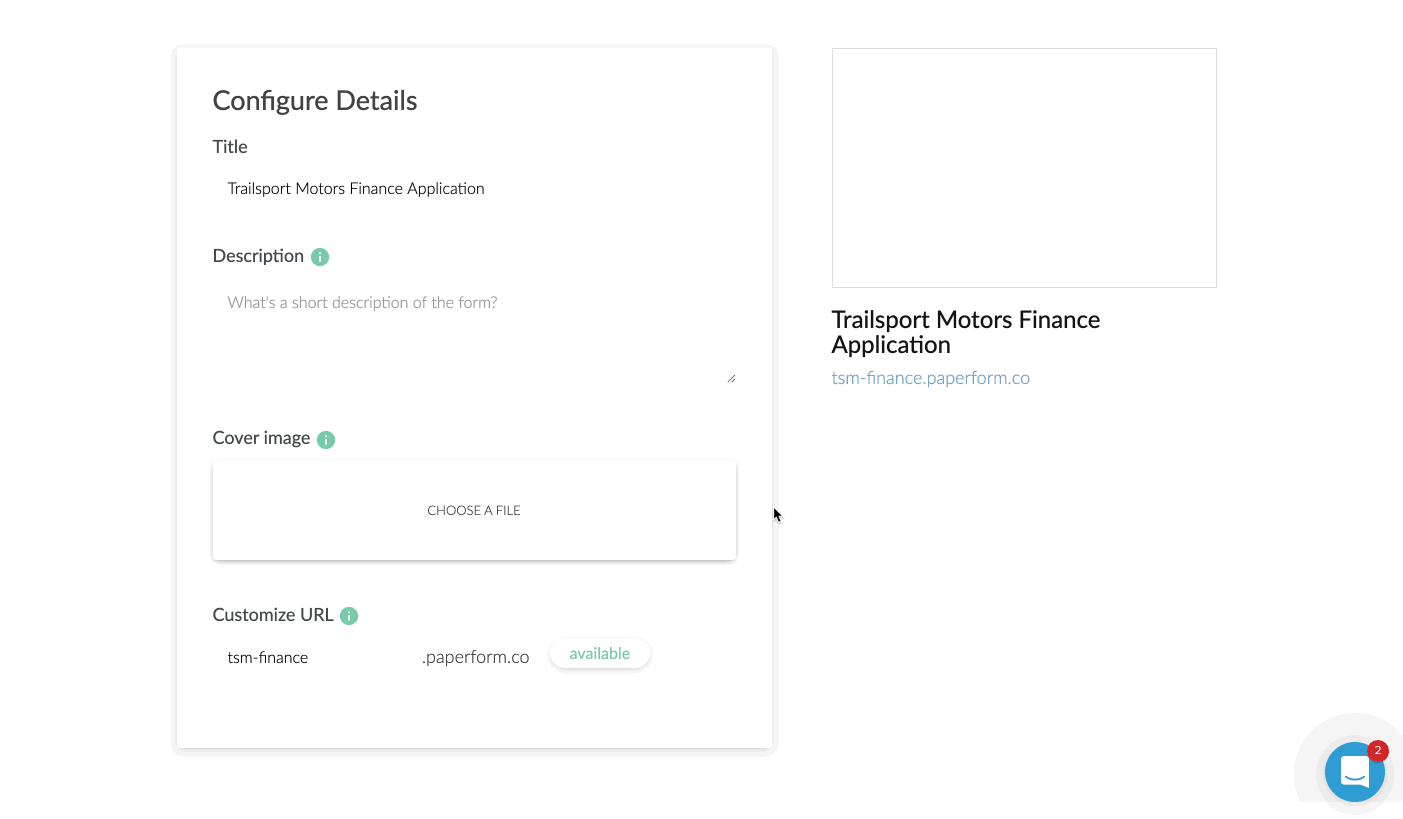
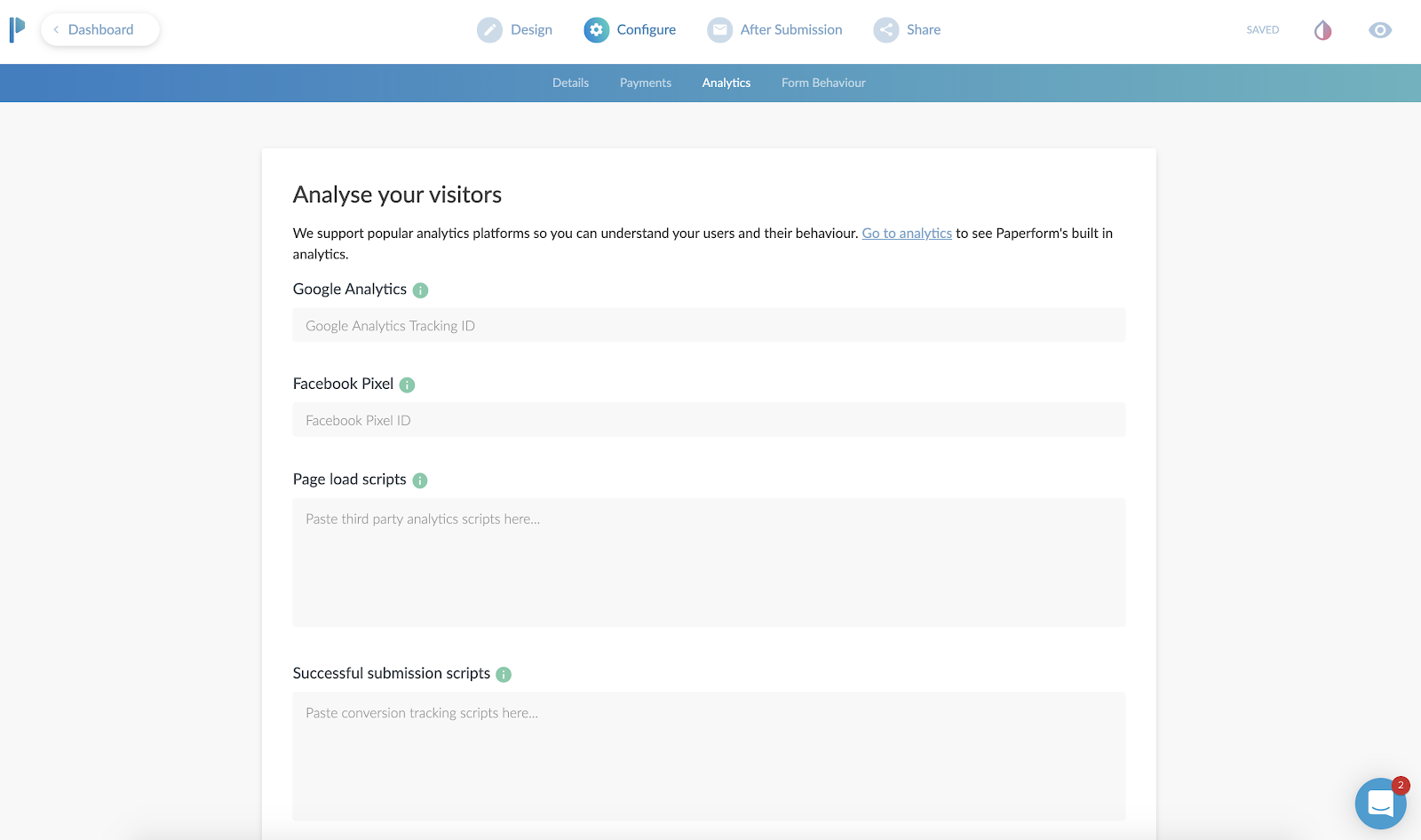
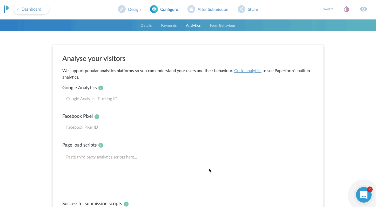
The Configure Tab
First up is the URL. If you are NOT planning on embedding this to your website, I’d highly recommend changing the URL. It will make it easy for you or someone else to remember.
From this first configure tab, you can also adjust the title, description, and cover image. This is excellent because if you plan to share the URL directly, those three elements will come up on Facebook when sharing the URL.

When I drop in the URL for this form, you’ll see the cover image I put in comes up as the share image on Facebook, automagically. In addition, the title (bold area) automatically pulls in as well.]
Now, if you are going to take payments here, you can just click on the payments options of the configure tab as well. In this area you’ll also be able to put in your Google Analytics ID and Facebook Pixel ID. This is very helpful again if you are using this as a stand alone landing page to track conversions.
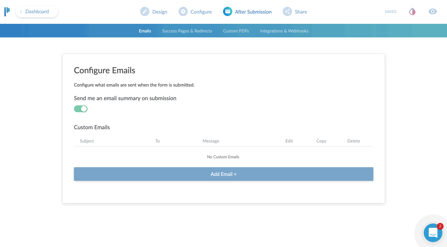
The After Submission Tab
I absolutely love this tab. Here you can configure the email that goes out when someone submits the form completely. It can be just a simple “Hey you have a new lead and here are the details”. Or, you can get a bit fancy and customize the email. This is where you can tell Paperform to attach a PDF copy in the email. Or set the “reply” address as the person who filled out the form, so that you can literally just click “REPLY” and reply directly to the lead from that email.
By the way, we’re almost done here.

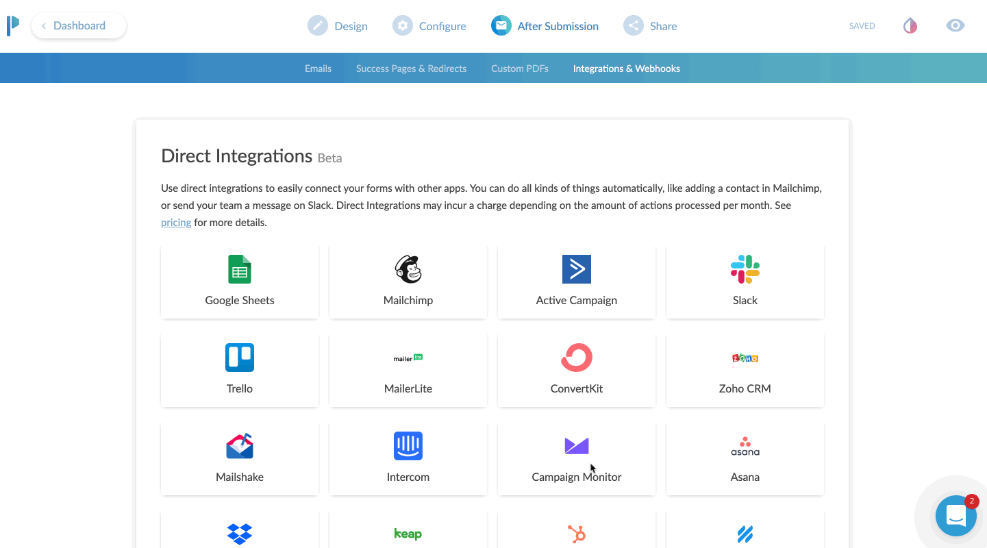
The next part of CONFIGURE is your integrations area.
You can send just about any data you collect over to an existing partner integration. Common uses would be sending data to your CRM or email marketing program. If you don’t find an existing integration, no sweat. Just choose Zapier and then configure your zap to go out to any of Zapier’s 1,500 plus apps.
The Share Tab
The share tab is pretty straightforward and easy.
This tab gives you two options. Either a direct share link to copy to your clipboard. Or an Embed option, which offers three ways to embed your form directly to an existing website.
For my client, I chose the inline embed. This places the form natively in the flow of the page it’s on.
The full screen embed is kind of neat. You place it on the page of website you want it to appear on, but instead of squishing in line with your content, it just takes over the page. BUT, it keeps the URL of your website. This is great for SEO and traffic to your site. Instead of sending traffic to a paperform.co URL, you get to send traffic to your own domain, but without having to configure a new page in your website editor.
Lastly is the pop-up option. I really like this actually. This would be a great option if you wanted to place a button on your website that says something like “Click here to subscribe to our newsletter”, and then a little box pops up with an email address field.
This is another type of micro-conversion. If the visitor clicks that button - it was intentional. They are WANTING to sign up for whatever you’re asking them.
Bonus: Theme Settings
This isn’t really a tab, but it is in my opinion, and important part of your form.
Click the little ink drop icon in the upper right and you’re brought to a theme settings area.
Here I was able to change the default blue to my client’s branded color of orange. I also customized the font choices here and as a nice surprise the background choice. The default was a light gray background. However, I was going to place this on their Shopify website, and there was already a background color of that page.
I set the color to NONE. You do this by clicking on the background color, then moving the transparency slider all the way to 0%.
Optionally, you can choose a background image instead of a color.
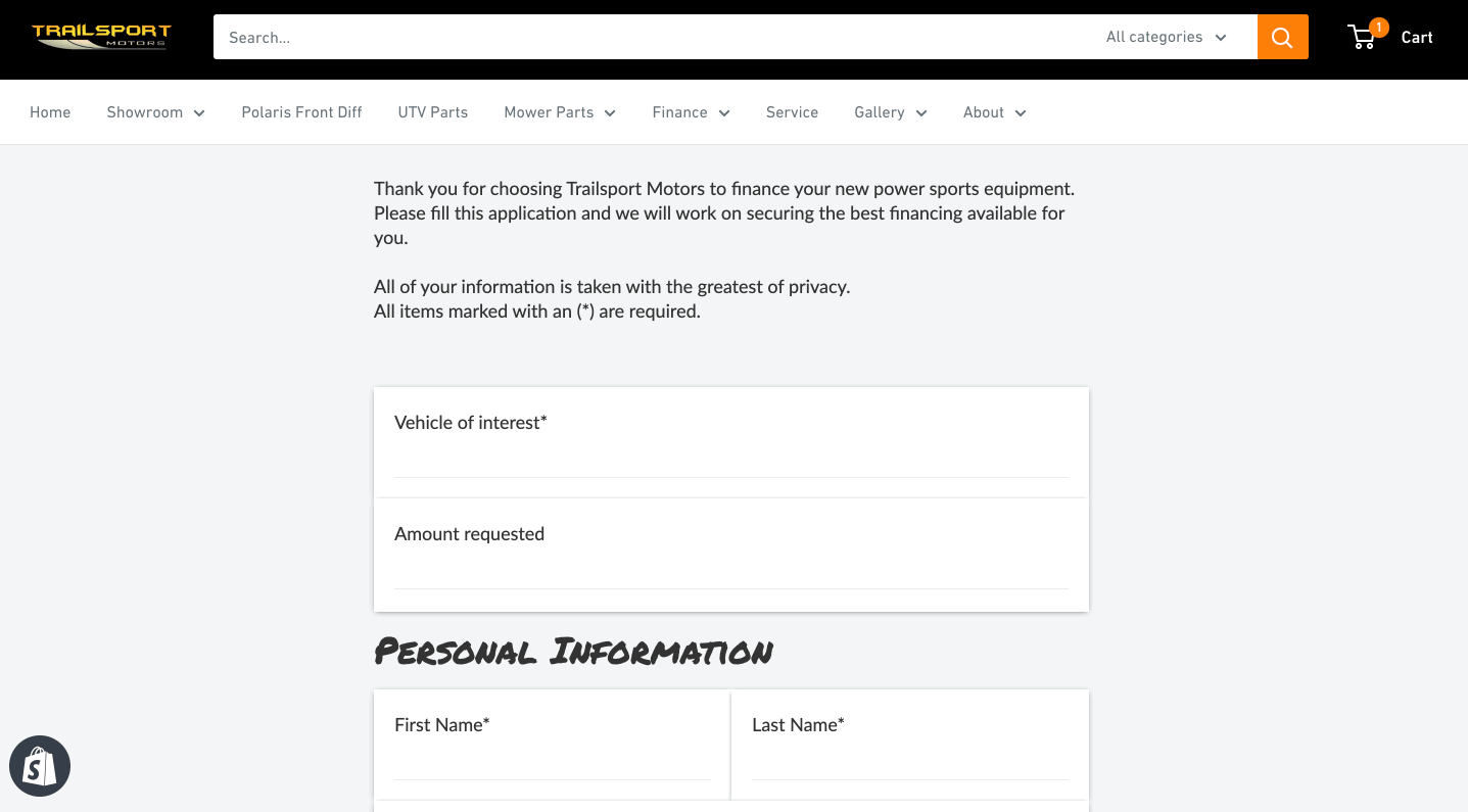
The Final Product
Here’s how it all looks once placed on the website. It looks and feels like a natural part of the Shopify site, but all pulling from Paperform!
From start to finish, I’d say this form took me about 15 minutes. Now truth be told, it took me longer but I was creating GIF recordings the entire time as well. I’m estimating 15 minutes.
I did go back and create another form for the client, which was limited to 5 questions. It was to request a service appointment.
Now that form, took me about 3 minutes to create I think? Since I already had one form under my belt, this second form was extremely easy and fast to create.
The Best Online Form Maker ?
All in all, I would say Paperform is the most versatile form creator on the web today. It’s easy to use and highly customizable to fit a variety of needs.
Remember – forms today are more than just name, email, phone, and message.
The ability to take payments, use smart logic to navigate the form, accept signatures, route responses to certain emails, and a crazy easy form editor makes Paperform my go to form editor for now on.
*Please note: In exchange for an unbiased review of Paperform, I received free use of the Paperform service. My opinions of the product were in no way influenced by this.

What to Look for in a Contractor Website Design
If you’re looking to upgrade your business website or create an entirely new design to draw in more customers, then it’s important to understand what elements of website design are important for your specific business.
If you’re looking to upgrade your business website or create an entirely new design to draw in more customers, then it’s important to understand what elements of website design are important for your specific business. In terms of contractor web design, the idea is simple; you want it to be easy to read, you want your contact information readily available and you need to encourage your viewers to contact you.
To help illustrate these points, let’s take an in-depth look at the elements that make up a good contractor web design.
Be clear about what services and products you’re offering to customers
There’s nothing worse than a contractor that can’t make up their mind about what services they offer. Sure, you might have a wide range of services, but actually listing them instead of being vague is a good way to actually let your visitors know what you can do for them. Of course, you shouldn’t list every single thing especially if there’s a term to generalize them. For instance, you don’t need to list every type of flooring option you have; simply mentioning that you have a variety of flooring options and then listing them on a separate page is good enough.
Understand your target market inside out
If you understand your audience then you understand what services they’re looking for. If you’re targeting a high-end renovation market then your website needs to be clear, modern, elegant and showcase some of the work that you’re most proud of. If you’re a construction contractor that wants to appeal to a wider audience and different price points, then don’t make your website too wordy and keep the language simple so that your services seem accessible.
Make the content short, concise and meaningful
One of the biggest pitfalls of any contractor website is writing too much stuff on the front page. Keep it clear and concise and focus on keeping your content short so that it’s meaningful and not full of useless words that don’t contribute to the overall experience. The more straight and to-the-point you are, the less time your customer wastes and the higher the chance that they’ll pick up the phone and give you a call if you appeal to them.
Big and bold statements are attractive
Simple, big and bold statements like “You dream it, we build it” and “Beautiful Yet Affordable Landscaping” are ideal for contractor websites because they catch the attention of your viewers and it’s immediately clear what your business offers. This goes back to the idea of keeping your content short, meaningful and concise.
Let your audience know the benefits of working with you
Don’t list all of the services you provide and the accolades you’ve achieved. Instead, describe your services by letting your audience know the benefits of working with you to make it more attractive. For instance, “Realize your dream garden designs with our professional landscaping service” is a much more attractive title than “We are experts in professional landscaping”.
Keep the design simple
Navigation of your website should be simple. You should have a menu somewhere to switch between main pages and nothing on your website should ever take more than two single clicks to reach. Burying information in a labyrinth of links is a no-go and you should always simplify your website navigation to make it more accessible.
Always have a “services” page
While your front page should offer some basic information about the services you offer, it’s always a good idea to include a more detailed services page which goes into more detail about what you can offer. This will help your audience understand your services better before getting in touch with you.
Pictures tell a thousand words
If your contractor web design is full of text and zero pictures then something needs to change. Make sure you add pictures where necessary such as for your front page and in your “about us” page in order to break up text and make your content flow better.
Have a “team” or “About Us” page
A great way to introduce more customer trust is to have a team page or an about us page so that your viewers can get a better understanding of your philosophy, your services and also your experience. Having pictures of your staff members can also be a great way to introduce more trust in your brand especially if they are the contractors that you’ll be sending out.
Make sure your website is viewable on desktop and mobile devices
Smartphone users account for roughly half of the internet users in the country so it’s vital that you create a responsive web design that fits the orientation and size of the viewer’s browser. This is something that can be automatically done with the right web services, but the idea of optimizing your website for mobile users should be a consideration from the very beginning. This means less text, more images, bigger links and having information reachable within 2 clicks at most.
Ensure your contact information can be clearly seen
Every page should have some kind of contact information. Whether it’s contact details at the foot of your website or having your phone number at the top near your logo and banner, it’s vital that your contact information can easily be seen so that your viewers don’t get frustrated trying to find it or forcing them to click on your contact details page just to find it.
Adding a portfolio page is a great way to create trust
Every contractor website design should have some kind of portfolio page that shows real work that you’ve done. This helps to create trust in your brand and also shows your customers what you’re capable of. It’s a good idea to take pictures (with consent from the client) of the projects you work on so that they can be used on your website as background images and as part of your online portfolio. A brief description of each photo can also help your audience understand what they’re looking at.

5 Web Design Trends To Boost Conversions in 2019
Do you want to know what’s coming up in 2019 for Web Design trends? What if these trends could help you improve conversions on your website? Well stick around because I’m going to break down all of the 2019 Web Design Trends that will boost conversions
Do you want to know what’s coming up in 2019 for Web Design trends?
What if these trends could help you improve conversions on your website?
Well stick around because I’m going to break down all of the 2019 Web Design Trends that will boost conversions
I’m all about helping local businesses leverage the power of online marketing in a simple, and affordable way.
If you’re new to this channel, and you want to maximize your online marketing strategy this year, then be sure to subscribe and hit that bell button so you don’t miss anything!
Trends come and go with any industry. There’s no shortage of trends in web design. Knowing what trending in web design for conversions though, will help your website do its main job: Convert visitors into buyers (or leads).
If you’re in eCommerce, you want people to BUY your product, not just window shop it.
If you’re in a service business, you want your visitors to take action and make an inquiry.
If you’re a local business, like a retail store or restaurant, you want people to visit your location or call you, etc.
Trends come and go with any industry. There’s no shortage of trends in web design. Knowing what trending in web design for conversions though, will help your website do its main job: Convert visitors into buyers (or leads).
So here are my FIVE web design trends that will boost your conversions in 2019.
1. Live Chat / Chat Bots
As customers become more independent in their shopping, they are looking for quick, instant answers to their questions – and they don’t want to call in for this. Part of this is due to a history of high-pressure sales teams you meet on the phone. Live chat gives your visitor the control they desire while having accurate information at their fingertips.
You don’t always need to be available to interact either Most live chat apps allow for a chat bot to be easily created.
Based on a series of pre-triggered questions, it will lead your visitor to the right place
With the option of being alerted if the visitor is looking for a live person. Matter of fact, let me know in the comments if you have used a live chat box on a website you were browsing. I’ll also leave my go to live chat app I recommend to all of my clients.
2. Website Personalization
Interestingly, this isn’t all that new of a feature. I’ve been using this on client sites for several years now. Personalized content is becoming more readily available to anyone. Let’s say you’re a restaurant. If you’re using my Rocket Website platform, you can display an offer on your homepage that will ONLY show on Tuesdays between 2pm and 9pm and display your Taco Tuesday offer.
So think about that power. You have someone around 4pm on a Tuesday getting hungry at work. He visits your website and instead of having to search around for your specials or your menu, your website auto-magically displays your Taco Tuesday offer.
Or let’s say you’re a plumber who offers 24-hour service. You get someone on your website at 11pm. Trust me, they’re not reading your about page at that hour. They need IMMEDIATE HELP. Your Rocket Website will change the homepage content to let them know you offer 24 hour service and will show your after hours number to call for immediate help.
3. Multi-step Forms
Next up we have multi-step form. There are usually two types of lead forms on a website.
The short and sweet form that asks for name, email, phone and a message
The super long form that makes you feel like you’re buying a house
A multi-step form takes the benefit of the long form while visually appearing short and sweet. Let me explain. What you’re doing is breaking up all of your lead questions into big chunks.
We’re looking for micro conversions\
For instance, if you’re a contractor, ask for their zip code first and only their zip code. Having someone presented with a form that’s only asking for their zip code is a super low barrier for them. You have to remember, people are just more skeptical now than ever before. They’re reluctant to enter in their personal info. A zip code is hardly personal.
Once they enter their zip code, you can get the next micro-conversion.
This might be what style kitchen they’re looking for, how old their house is. Then on the third step, you can ask them for their personal information
You’re basically asking all of the questions in reverse from the way you normally would. By the tie they get to the third step and you’re asking for their name, email etc - they’ve already mentally committed 66% of the way !
Micro-conversions for the WIN.
4. Brand videos
If content is king, then video is the queen. We already know video is so hot right now.
I have used videos on websites in a few ways. Sometimes by way of testimonial videos from clients, in other cases creating explainer style videos that feature animated graphics. Consumers are not reading those fancy “about us” pages anymore. Instead, they’re looking to discover companies by way of their brand video.
What’s a brand video?
It’s your moment to really shine and give a GREAT first impression.
Think of it as your best marketing employee and your best salesperson all wrapped up into one video. The best part is, since it’s the same video shown to each visitor, you maintain a consistent message EVERY time for your brand. YouTuber Amanda Horvath has a great tutorial on creating your own Brand video. I’ll link it up in the cards.
5. Triggered Opt-In Boxes
Last but not least are triggered opt-in boxes. NO, these are not your cousin’s pop-up box that hits you in the face soon as you enter a website. Tell me in the comments if you hate pop-up boxes or not.
These are targeted opt-in boxes that only appear at certain times or based on visitor behaviors.
The most effective targeting option I’ve found is an “exit intent”. Most opt-in tools will detect when a visitor is about to leave a website. Based on this movement, it will trigger the pop-up. Or, it can trigger a different type of box - either way, asking the visitor to perform an action before leaving.
Another powerful targeting option is scroll depth. You might discover through a heat map tool that your visitors leave your blog page or product page after they’ve gone only 55% of the page’s depth. Set an opt-in box to scroll in from the bottom at 45%. This way your visitors will see your offer before they ever get to the point of leaving.
You can also have a notification bar drop down if someone RETURNS to your site and display a “welcome back” offer.
All of this actually stems from the personalization trend, but now we’re taking these targeting options and presenting a highly desirable offer to that visitor.
I recommend everyone use Convertful, a super easy opt-in tool. I use it on many of my client sites. One of them is an e-commerce brand and we get anywhere from 5-8% email conversions from our targeted boxes.
Might not seem like a lot, but on average, eCommerce only converts 2% of their traffic into sales.
These email subscribers are automatically sent a coupon in which they can redeem right away.
On a recent campaign for this same client, we achieved a 64% email open rate and gained $252 in revenue.
I hope you found these 5 web design trends helpful to your conversion goals.
QUESTION OF THE DAY:
Which of these 5 web design trends are you most excited to try out on your website?
I’d love to hear your thoughts in the comments below.
Then hit that subscribe button as I upload a new marketing tip every week.

Why Your Website Isn't Converting
Newsflash: Your website probably isn't doing anything for your business. Here's why.
BONUS from video:
My #1 app for capturing more emails on your website.
Video Transcript:
Sorry not sorry to be so harsh, but we need to talk. Your 'pretty' website, you know, the one with the cool *ish your web designer did for you? Pretty doesn't sell.
You know what sells?
W O R D S.
😳 Here's something your web designer won't tell you – the beautiful big images and cool things like background video mean jack squat for conversion.
Pictures tell, stories sell.
Now, with enough traffic, even the worst converting websites will bring in new leads.
What if you could bring in SOME traffic, but capture more leads, generate more sales, and grow your business.
That's what copywriting will do for you.
I know, copywriting is tough. It sucks if words don't come naturally to you.
In case you didn't know, I was born with the gift of gab, not words.
HERE'S one quick tip on how to get better with your copywriting: Just talk to yourself in the mirror as if you were selling your product/service. Record it, write it down.
That's your starting copy.
BONUS: Want to see how you can double your email opt-in rate in the next 30 days?
Click here for my #1 recommendation to increase your email opt-in rate.

Should You Outsource Your Social Marketing?
Deadlines. Employees. Networking. Accounting. Advertising. HR. – The Party Planning Committee. As a small business owner, you likely wear many hats. Should marketing be another one?
Deadlines. Employees. Networking. Accounting. Advertising. HR. – The Party Planning Committee.
As a small business owner, you likely wear many hats.
“Wait, now I have to wear a marketing hat also?”
Well the short answer is no, you don’t have to. It really depends on how competitive you want to be in your industry.
Your big competitors invest lots of time and money into marketing their business, but that doesn’t mean you have to. Outsourcing your digital marketing to a digital marketing agency can both improve your lead quality and improve your overall ROI.
Let me explain.
Your Time Is Your Most Valuable Asset
Time is the one thing that no matter what, you cannot buy more of. Even the wealthiest celebrities with the likes of Kim Kardashian cannot buy more time. What you have to do is, make the best use of your time.
How long does the average digital marketer need to spend each week marketing their business online?
The short answer is: It’s a full time job, literally. But let’s look at some examples from social media today:
Social Media: The majority of businesses spend 6 hours per week on social media
Blogging: The average post can take 1-3 hours to develop content.
Citations: Depending on how many directories have your business listed wrong, it might take you a couple hours each month to fix your directory listings.
Review Monitoring & Response: Scouring the internet for mentions of your company and then responding to those reviews can take 3-4 hours per month.
Those are just the basics of digital marketing: Social media, blogging, local citations, review monitoring.
We’re not even discussing marketing automation, video marketing, on-page seo and more.
Based on just those four areas, for digital marketing to be effective, you’ll need to spend roughly 34 hours per month to create engaging social media posts, two blogs per month, fix your citations and respond to online reviews.
So if you’re a small business owner looking to gain an edge, you probably don’t have it in your budget to hire a full time person just for your digital marketing. Nor do you have the time to spend 10+ hours per week on your digital marketing strategy.
Outsourcing your digital marketing can save you both time and money from hiring someone for your organization.
Expertise in Digital Marketing
So let’s say you’re willing to spend that 34 hours per week on digital marketing, or you want to go ahead and hire in that new staff person to do this. Great.
How much experience do you have?
Chances are, it will take you several months before you acquire all of the tools and training necessary to become effective with your time.
Case in point: Just because you’re posting to social media 12 times per week doesn’t mean that it’s effective.
Are your fans engaging with those posts?
Are they sharing your posts?
What’s your email open and click through rates?
How long is the average visitor reading your blog article?
The answers to these questions will tell you if your digital marketing strategy is effective or not.
You might have the extra time to devote to your digital marketing, but will it pay off if you go the DIY route?
Perhaps. Perhaps not.
Measuring Your Digital Marketing Strategy
Ok, at this point, you are spending the time on your digital marketing strategy, and your are getting better at it.
How do you know it’s working? How are you correlating the time and money invested into revenue?
For every hour you or your staff person spends on digital marketing, how much is that costing you.
Let’s say you hire in someone at the rate of $20/hour x 32 hours per week, that’s costing you more than $2,500 in labor alone, besides taxes and other fees. That’s not counting the cost of any marketing automation and other marketing tools you probably need.
Let’s just say between labor and other expenses (and we haven’t even discussed PPC budgeting), for marketing you might invest over $4,500/mo.
Are you getting at least a 2x return on that each month? Rather, are you bringing in at least $9,000 in sales each month for that?
I should note that, for most small business owners, outsourcing your marketing should cost no where near $4,500/mo. Outsourcing should save you quite a bit of money AND provide a better return on your investment.
Outsource Your Digital Marketing - Yay or Nay?
Thinking about a statement earlier, it all depends if you want to be competitive or not.
Let’s do a test.
Head to google.com, open a private browser tab (incognito, etc) and search for your industry keywords. Don’t search for your business by name. So if your business is “Joe’s Plumbing & Heating”, don’t search for that.
Search for how you want to be found if someone has not been introduced to your business before.
Something like : “Plumbers near me” or “Plumbers in [insert city here]”
The reason you do this in a private window is that it will remove previous search history.
Google is smart. They know you’ve been to your website before, so if you just search for “plumbers”, it will bring up your site first because you’ve previously visited it before.
So, what were the results of this quick test? Were you on the first page? Were you on the top 3 listings? Do you see your business somewhere in the Google Map Pack results?
No?
Then you need to outsource your digital marketing.
Or, you’re just OK with your competition being on those pages.
If by now, you think it’s a good idea to outsource your digital marketing though, you should look for a digital marketing agency.

How To Get Your Own Kitchen Remodeling Leads
If you’re a contractor or remodeler, generating leads can be a timely, costly and aggravating experience. Word of mouth and reputation can go a long way, but when the phone isn’t ringing like you need it to, harnessing the power of the internet to grow and position your company for long term success is critical.
If you’re a contractor or remodeler, generating leads can be a timely, costly and aggravating experience. Which is likely why you’ve ended up on this page in the first place.
Word of mouth and reputation can go a long way, but when the phone isn’t ringing like you need it to, harnessing the power of the internet to grow and position your company for long term success is critical.
Where to Start Getting More Remodeling Leads
One of the key problems faced by kitchen remodelers is knowing where to start with their online lead generation efforts. The internet is wrought with scammers, and full to the brim of shiny “new” and (allegedly) effective ways to make you millions.
Because of this, most kitchen remodeling business owners have a hard time discerning what methodologies represent the best use of time, energy, and hard earned dollars for their unique business.
Do you focus on your website, social media, search engines, or pay per click ads (PPC) like Google AdWords? You don’t have to do everything, but the best plan is usually a combination of the above, leveraging each to bolster the next with a holistic and well-rounded game plan.
Funnels
It’s not a great idea to pick a favorite child, but if online marketers did, it would probably be funnels. If that term is new to you, don’t worry. A funnel is essentially just a series of steps prospective customers take to find your business and take some sort of action leading up to a sale.
But just because you build a funnel doesn’t mean anyone will come to it. Below we’ve included a quick rundown of how the tools mentioned above can work together to “funnel” new remodeling leads to your business.
The Game Plan – How To Get Your OWN Remodeling Leads
Let’s say you want to generate kitchen remodeling leads. If you can just get prospects to call you, you know they’ll love what you have to offer, and will become satisfied customers for years to come.
But how do you get them into that funnel in the first place?
1. PPC – Pay Per Click Advertising
When someone is looking for kitchen remodeling, they usually start searching for contractors on Google. One way to get their attention is to use Google Ads, formerly known as Google AdWords.
Your ad will show up at the top or bottom of the search results page and, hopefully, get more attention than the regular results.
Pros – If you’re willing to pay a bit more, you can get results quickly and a treasure trove of data that can be used for other marketing channels like social ads and SEO
Cons – Some people ignore sponsored ads, and commonly searched keywords are very expensive to advertise. There may also be a testing period while the campaign is “fine-tuned”, during which you may experience a lower ROI, or even an initial loss.
How to make it work – Targeting and ad grouping is key. If you can target very specific keywords and demographics, the ad will be shown to people who search for those specific keywords in a geographic area that you service. Further segmenting this traffic into various demographics and interests will also help you find which type of visitor converts best.
Targeting and fine-tuning campaigns is imperative because you pay for every click, whether they buy from you or not. You don’t want unqualified or uninterested people to click your ads just because of a catchy headline only to realize the offer isn’t for them.
2. Social Media
Setting up social media pages for your business is another way to generate remodeling leads. It takes a little more time than advertising, but can be very cost effective and great for building a trusting and interactive relationship with your target audience.
It’s better to focus on one or two social media sites (like Facebook, Twitter, YouTube, or Pinterest) and build a solid presence rather than spreading yourself too thin trying to be on all of them.
Pros – A free or low-cost way to build your reputation and connect with clients. Most of your prospects are already on social media daily.
Cons – It can take a lot of time to build your presence enough for people to find you.
How to make it work – One great way to use social media is be providing helpful and valuable content. If you have insights on kitchen remodeling, you can create videos, how-to articles, or share pictures of recent projects or DIY suggestions. People love to share this type of information with friends, which can quickly spread your name and reputation if you play your cards right.
Another way to use social media is to ask your existing clients to review your business page or recommend you on social media. As you know, testimonials and reviews mean a lot in this business. Positive reviews on social media have extra power because they are shared with people your clients already know, boosting the credibility of the reviews.
3. Your Website and SEO
Your website is a powerful tool for reaching new clients, as well as growing your relationship with current clients. In fact, your website is likely your best performing employee, and you don’t even give it a raise.
Your company site is a 24/7/365 digital representation of a physical store and showroom. It is your sales team, helping to convert new visitors into paying customers, as well as your customer support staff, answering questions by providing information to those that need it.
But gone are the days when slapping a website up was a guarantee that traffic will appear from the ether. With competition as fierce as ever, the “if you build it they will come” mentality just won’t cut it.
Unlike social media or paid ads, people don’t run across your website during the course of their normal day to day activities online. Rather they generally find service sites like yours with a “Google search”. And if you’re not ranking on page one, you’re missing out on the 97% of web traffic that never bothers to click past the first page.
The simplest way to grow traffic to your website is to tell everyone about it. Print the URL of your site on your business cards and at the bottom of all your marketing materials. Put it on invoices and receipts, so your current customers can check it out. Place a link to your site on your social media pages and anywhere else you can think of.
But the most effective way to bolster your website’s online visibility and ranking is by employing a search engine optimization (SEO) strategy that focuses on website optimization as well as high quality link building and content.
Putting it All Together
Here’s where the rubber meets the road and you really start making progress.
By effectively employing the above tactics, either in part or as a whole, you can leverage the power of the internet to drive more remodeling leads faster than ever before.
Remember the sales funnels from earlier? At the very top of the funnel, you’ll bring a fairly wide group of people into your world. Sharing great content on social media is one way to do that. People see the value you offer and even share it with friends.
Paid ads are another way to get your business in front of people who aren’t already in your circle. In either case, you don’t want to go TOO wide with the funnel, so make sure your ads and content are relevant to the ideal client you want to attract. This is especially true with ads, where you will pay for the traffic whether they are a good fit or not.
Next, you can bring those remodeling leads further down your funnel and closer to becoming customers by getting them to your website. With ads, this is as simple as linking them to the appropriate page on your site when they click the ad. With social media content, you can provide a link to more information or start a story on social and let them click to finish it on your website.
The final stretch of this basic funnel is to make sure your website contains all the info they need (in the most compelling language possible) to convince them to do business with you. This is where can sell your services, and what makes you the best choice for their remodel, without spraying sales pitches all over people who haven’t yet shown an interest. By the time your readers are on your website, they are more likely to be receptive, interested prospects who are seriously seeking the best contractor.
Not Sure Where to Start? – We can help
Our agency has helped countless kitchen remodeling companies just like yours drive more traffic, generate more leads, and boost sales and revenue month after month, often for a fraction of what you’re spending on “traditional” marketing methods.
Give us a call today for a free consult to learn how we can help. We’d love to hear from you.

Best Ways to Get Your Own Construction Leads (Updated 2020)
Business in today’s economy is a cutthroat and competitive landscape. While marketing and lead generations come and go, with some tactics employed by entrepreneurs ranging from laughable to downright outrageous, one thing is a certain fact: no business can survive without a steady stream of qualified construction leads flowing in daily.
The average consumer today is nothing like who they were just 10 years ago.
They want to feel connected with the brands they shop with.
This means they want you to share the same values, desires for the future and solving problems that mean something to their everyday well being.
This is the direction of marketing you need to be heading in if you want to gain qualified construction leads that understand and like what you do.
You don’t need to reinvent the wheel, but you need to reinvent your narrative as the world changes around you. This is perhaps why content marketing has become the focal point for millions of business owners.
Changing with the times means you have longevity, i.e. staying relevant in whatever kind of consumer climate you’re in.
Never forget those who have been loyal to you, and produce content that will show them how you have advanced and improved your services and products for them too.
Importance Of Lead Generation For Construction Businesses
Leads are the oxygen your business breathes.
As more and more people enter into the middle-class, the world will begin to see millions of micro and small business owners.
Without a constant stream of new customers such as these, you won’t stand a chance against the competition.
They want to see what kind of offices, warehouses, retail stores, high-rise buildings and event halls you are creating.
They want to see with their own eyes, what kind of materials, styles, designs and interiors you create from scratch.
But only if they click on your content, read your story and watch you at work, will you convert your leads.
Leads are the oxygen your business breathes.
Construction Lead Generation – The Correct Approach
Say it with me now, “content is king”. This is a term that was used sort of a funny joke in the early 2000s. But sweet heaven above! Now it's like a battle cry or a mantra you must chant in your sleep every night! Well, okay, perhaps not that serious. However, you have to realize that consumers are no longer falling for clickbait, what they want is emotional marketing. They want to feel as if the products and services they use, matter in their lives; more than just pleasure, they want to feel a part of the growing world.
Let’s Have A Look At The Best Ways To Generate Construction Leads:
Blog Posts
Business blogs have become part of consumers’ daily lives.
They read them as frequently as you used to with a newspaper.
This means that the average customer who knows who you are will read your blog posts once a week at least. This could be at home just browsing before sitting down for dinner, it could be on the train heading into work or even as a dedicated read because you’ve just released some jaw-dropping news.
The best part of blogs is, they drive completely organic traffic to your website and can be from SERPs and social media.
On the other hand, you have new consumers who are not quite sure what you do. They should be seen as a juicy lamb to a wolf.
All they want to know is, how on earth will your products and services make their lives better?
If you’re wondering how to get construction leads, write fun posts about how your products have been used in the past, what your desires are for the future
For example, how people will use your products and services and how you intend to design them in the future.
Be honest, talk about the troubles you’re having when making or improving products. Consumers are very understanding and just like a rambunctious puppy, they wag their tail when you show them more about things that are normally ‘behind-the-scenes’.
Helpful Videos
Video content is by far the most popular of all the contents. Why? Well, it's kind of like audiobooks, why read something when it can speak to you?
This is why you need to have videos on your landing pages and homepage, to show customers exactly what you do.
On your services page, you need to have short videos, preferably around 1 minute or so, that show what it is you do.
Cover the process from start to finish
How do you plan things
How do you design things
How do you then set about achieving them, etc.
YouTube is the obvious platform where you should be uploading but also, using your 5-second to 15-second ads to drive leads from the traffic. Post your video content on your social media pages and watch direct messages from your accounts come rushing in.
Podcasting
One of the most underrated techniques for how to get construction leads. Podcasting shares the same value as blogs.
Everyone thought they were going away and that they were just a fad from the 90s. Wrong!
Now, a podcast is one of the best ways to become an industry authority. People listen to podcasts to chill out, listen on the way to work or just while they’re doing their laundry and ironing.
They are, however, nice relaxing places where you build a rapport with your customers by talking about fascinating insider-details about the industry you work in.
You should bring guests on to talk about their experiences in the same field you work in and have a genuinely interesting conversation.
It also gives you a chance to inject your personality into the content, which consumers love!
Photography
Photos are used even to this day but they have to be high-quality. With commercial photography, you’re trying to showcase your products in great detail, from all angles and show the customer what they would be getting. It also gives them a chance to see the dimensions, colors and style of what you produce. Higher quality images are shared more often on Instagram, than low-quality blurry embarrassments.
Remember, content is king. Don’t be afraid to be quirky, show your personality, talk honestly about the troubles and challenges you face in your business, but also, inspire your customers to be hopeful about the future with great blog, podcast and video content.

How To Pre-Qualify Your Remodeling Leads
When you focus your sales and marketing to qualify your leads that fit your expertise and availability, you’ll have better clients and better projects.
Question: Clicks or Customers?
What I’m asking is, do you want clicks or do you want customers?
If all you want is clicks, Google and Facebook are plenty happy to send thousands of clicks your way – you just have to whip out your wallet.
If customers are more your style, then lend me your ear for a second.
Here’s what a typical journey your remodeling prospect should be taking:
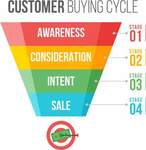
Awareness
Consideration
Intent
Purchase
Let’s break that down in real world terms
Person does a Google search for remodeling contractors
They come across your website
They contact you for more information
They contract you for their project
In a perfect world, those four steps would happen quickly and successively. But they don’t.
There’s a couple of steps in between 3 and 4, they are:
(3. They contact you for more information)
3a. You get in touch with your new lead
3b. You ask a few questions to see if you are a good match for them
3c. You go out for an estimate
3d. They kick the tires around for a bit
3e. They get other quotes
This isn’t all doom and gloom. It’s just a part of the buying process today. Even with a referral, people are still going to shop you.
What you need is a pre-qualification process. You need a way to make sure that every new lead coming to you is already pre-qualified.
Otherwise, you’re paying a lot for tire kickers. (Sorry Angie)
And, you’ll be spending (wasting) a lot of time going out giving estimates for leads that aren’t qualified for your skill level.
Here’s how to get your leads pre-qualified:
👉 BONUS: Get more strategies like this straight to your inbox each week. 👈
Start the pre-qualification process in the contact form on your website
While you don’t want to ask 15 questions to a website visitor, you do want to make sure you ask short, pointed questions.
To save room on your lead form, combine first / last name with just one field of Name. Also, don’t ask for their address yet.
Use a multi-step contact form. This way you can get micro-conversions. Micro-conversions are short steps a customer takes to get in touch with you. Not only does this boost your website conversion rate, but it actually helps pre-qualify your customer.
Your multi-step contact form can be just two or three steps. On the first step, ask a very easy, simple question. It doesn’t have to even be qualifying related.
For instance, ask:
“What’s your zip code?”
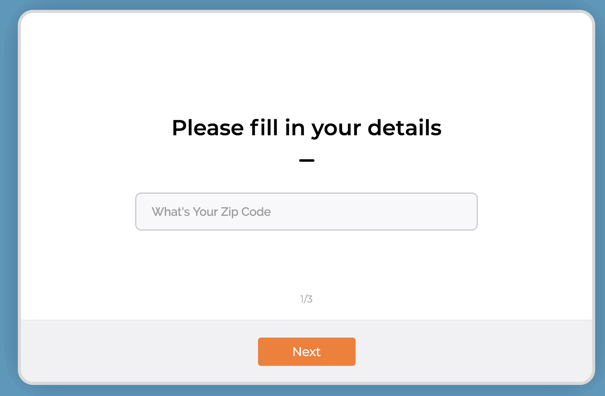
Now, does it really matter what zip code they are in? Within reason of course and your coverage area. But likely, you’re going to work in their zip code. So why ask this?
Micro-conversion. When they type in their zip code and hit “Next” - you just pulled a micro-conversion. For the win!
Now there is a higher likelihood of them completing the rest of the form and becoming more qualified.
The second question can be a little more pointed. Try this:
“What TV personality inspires you the most”.
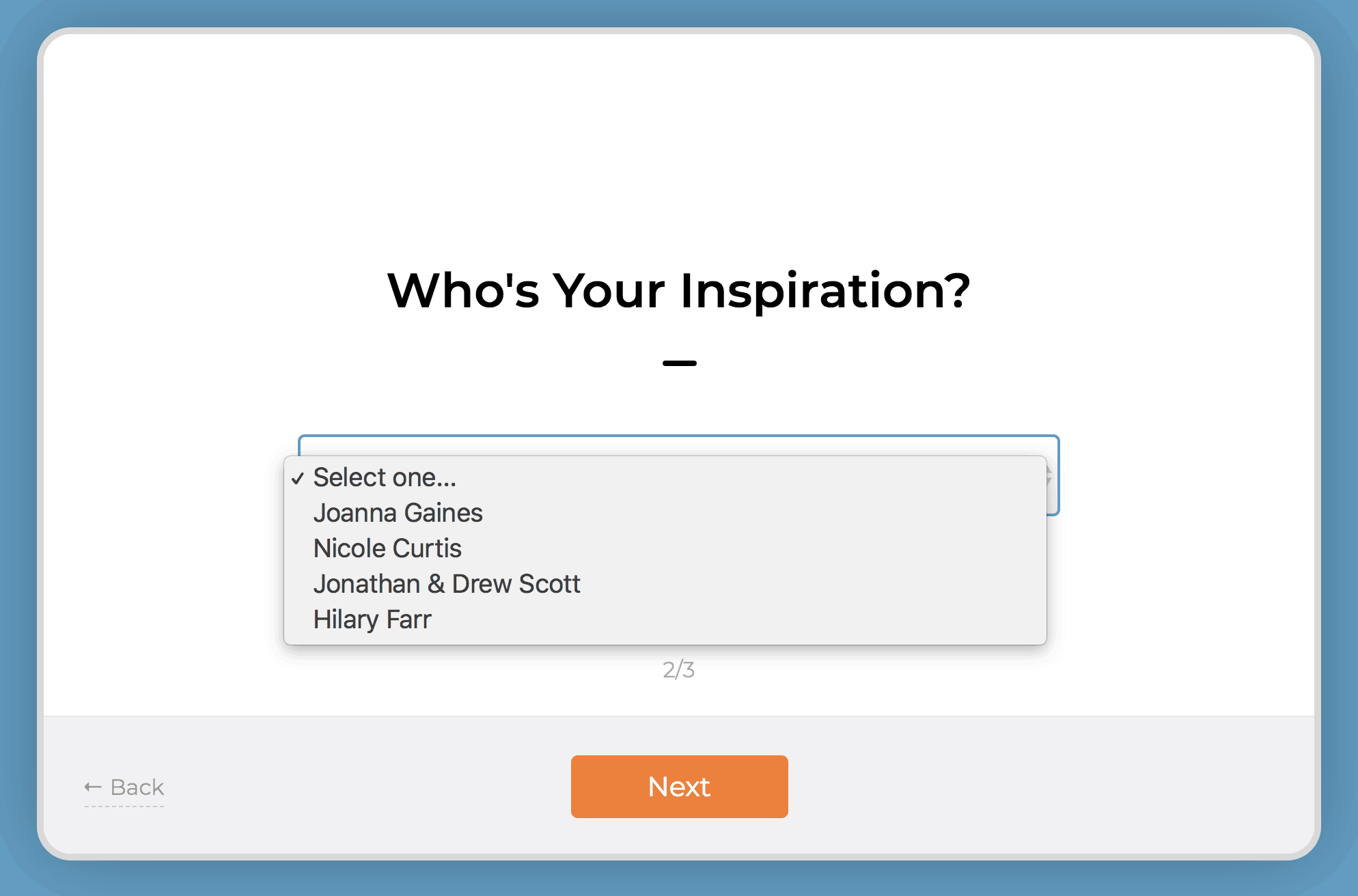
Use a dropdown box and fill it in with some home remodeling TV personalities. (Chip Gaines is my spirit animal btw)
Lastly, in the third step, ask for the juicy stuff - you know, their personal information.
Remember, name, email, phone numbers - that’s all currency in the world of lead generation. In order for someone to give up their email and phone number and be willing to be harassed (sorry) by a salesperson – you need to make them feel super comfortable.
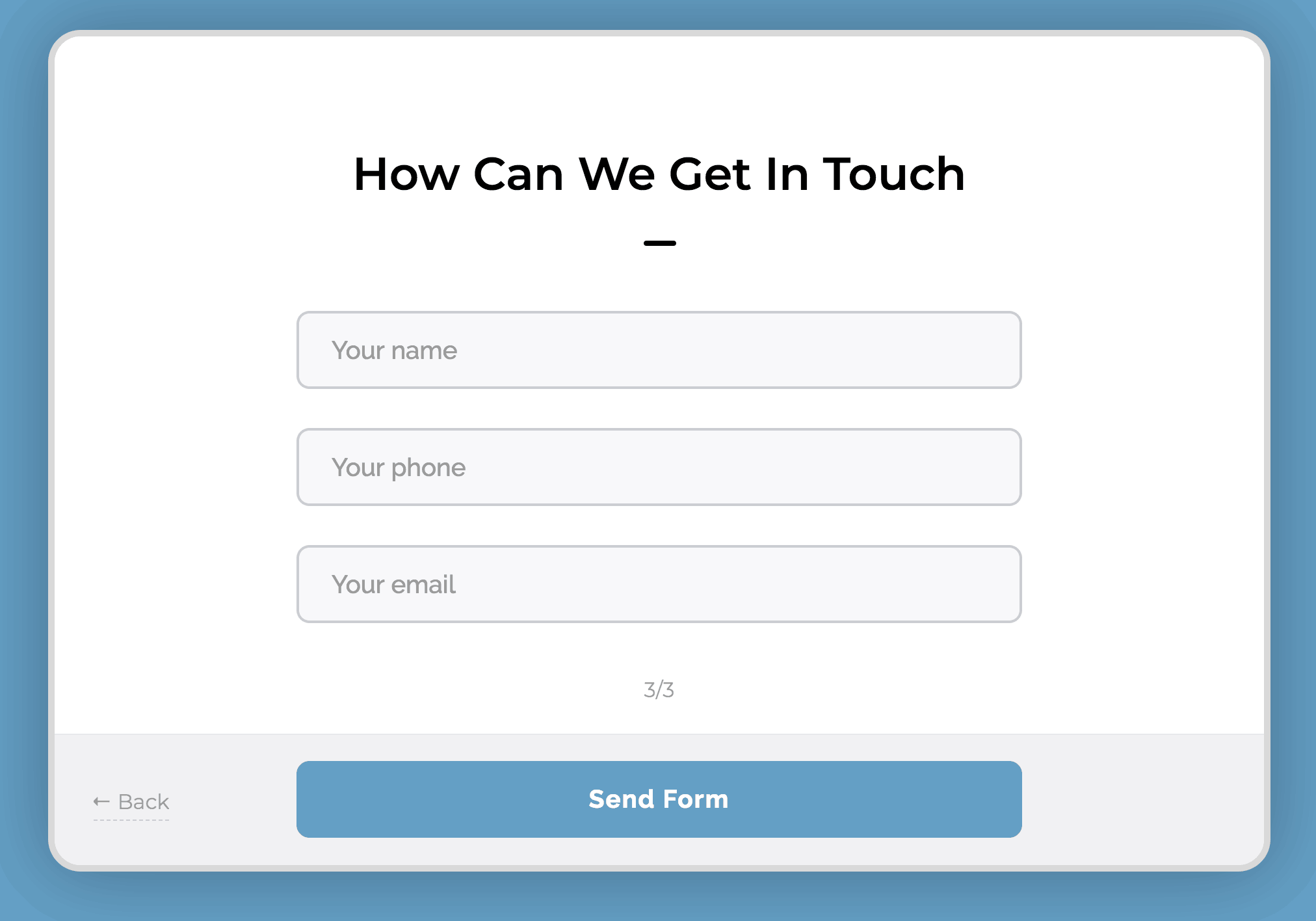
The micro-conversions do this for you.
Make sure to leave room for an open ended question like:
“Tell me about your dream home”
Finally, ask:
“Do you have a budget?”
These two questions are where you have an opportunity to pre-qualify them. Make this field mandatory. The budget question is often debated as to whether you should ask or not.
I’m not suggesting though, that you ask for their budget.
I’m simply suggesting that you ask them if they have a budget. Make this a yes or no toggle.
Why?
If they respond to those two questions in this manner:
Budget: No
Tell me…: I need my kitchen redone
It’s highly likely they haven’t done their research on how much an actual dream home will cost them. They are very much still in the “awareness” stage, though in their mind they want to be in the intent stage. You don’t have time for that.
Quick note on this, you’re going to get these requests no matter what. Treat everyone the way you’d like to be treated… even if they are unqualified to hire you, you want to make sure they have a positive experience during your phone qualification or in-person qualification. You’ll get better qualified referrals that way.
On the other hand, if the response is something like:
Budget: Yes
Tell me…: I’m looking to hire a contractor to redo my kitchen. Looking for someone to both design and build the whole thing.
This lead is definitely more qualified. I’ve seen this type of response come in many times to my remodeling contractors. Then I’ve seen them get in touch with the customer, send out a designer to get a measurement of the room and provide a quote - and then get the sale.
Qualify your new lead on the phone
Heads up – you should be calling your new leads within 5-10 minutes of the new lead notification. It’s highly likely that they are copy-pasting the exact message they sent you, to at least two of your competitors. It might just come down to whoever called them back first.
Call right away. They won’t care. They asked to be called.
Again, you want to be tactful. You’ll get more bees with honey than with vinegar.
Here are three questions to ask a pre-qualified lead on the phone.
Try to leave these all as open ended as possible.
#1: Tell me about your project.
They should be giving you a quick overview of the project. This will give you a little better idea of their personality and inspiration. Make sure you discuss priorities, their must haves and their timeline.
They say God gave us two ears and one mouth so that we can do twice as much listening and half as much talking. So, listen to their responses. Are they indecisive? Are they unwilling to listen to you when you’re talking? Are they demanding you give them quotes right over the phone? (It’s ok to give a range here, especially if they already indicated in the contact form an actual budget)
These types of responses though, can indicate a lead is unqualified.
#2: What’s your ideal completion date?
No, Mr. Homeowner, your project isn’t going to be done in two weeks. And no, it’s not going to be aired on HGTV.
TV Remodeling shows have done wonders for the remodeling business. It helps homeowners get inspired and get motivated. They want what other people have!
It does create some unrealistic expectations though. Not all homeowners understand the complexities of managing a full scale remodeling project. If you know your top-notch quality work for a 250 sq. ft. kitchen will take 3 months and they’re insistent it should only take you one month – run. Taking their deposit will mean taking their repeated phone calls as to why the project isn’t finished on time.
#3: Have you researched your project?
Homeowners that do their own research before calling a remodeling pro are much more likely to provide clear direction during the project. If the homeowner hasn’t done their homework, you will very likely end up with indecisive people and the plans will change – frequently.
When to move on
I know it’s tempting to just take any job that might come your way. In some instances, however, it might be better to just pass the job.
Pro Tip: Recommend another company that is smaller than you to them. They’ll appreciate the good recommendation and would be happy to refer your service to someone else, even though they aren’t qualified for you.
When you focus your sales and marketing to qualify your leads that fit your expertise and availability, you’ll have better clients and better projects. Take control of your lead generation today.
Want more strategies? Subscribe to our weekly email.

4 Ways To Setup ONLINE Gift Cards - EVEN IF YOU DON'T HAVE A WEBSITE.
Ok, it's apparent to me that things that seem "easy" to me, are very hard for others! I feel you! I'm showing you step by step how to create new gift card accounts or activate gift cards in your existing POS systems.
Time stamps to each of the options below:0:00 - Introduction and preface3:30 - Giftfly - This is a great option if you are using CLOVER POS in your store.12:25 - Gift Up - This is an option if you want to use on Shopify but aren't on their $79 plan that has gift cards built in.17:55 - Square - This is perfect if you are already using Square for your POS. Since you have an account already, it's a couple of clicks to add egift cards, and then they supply you with a link to check out online, you don't even need a website.20:58 - Shopify - Again here, you'll need to be on the $79 plan or higher. If you are, it's easy as like 2 clicks to setup gift cards with Shopify.Ok, it's apparent to me that things that seem "easy" to me, are very hard for others! I feel you!I'm showing you step by step how to create new gift card accounts or activate gift cards in your existing POS systems.If you need further help, reach out to me at brad@bearcityimpact.com, I'm more than happy to help.Also, the first two options are great options if you do not have any sort of digital POS system, IE old school cash register, and credit card machine.- Just a note on the legacy POS systems, you will have to keep a MANUAL log book of customer gift cards, because they will get the gift card via email, and there's no way for you to deplete the balance. This will require a manual logging of card balance when they come in and shop.Ok, I really hope this was helpful. If you have additional questions just reach out!#shoplocal #supportlocal #coronavirus